—-
To stay in the loop with the latest features, news and interviews from the creative community around licensing, sign up to our weekly newsletter here

“The more assets you have to work with, the better”: Talking cards with Martin Carter of Get Carter Cards.
First up could you give us a quick introduction to your career to date Martin?
My career in licensing started at Athena as a junior designer and proved to be a fantastic learning curve, working across licensed and non-licensed art prints, posters, cards and stationery. At that time licensing wasn’t as prominent at retail, or in our product portfolio – but when the likes of The Simpsons were signed, the impact of the right license was obvious.
I ended my time there as studio manager, overseeing the creative development and the licensing side of the business. I was then asked to join Danilo to help set up the greeting card side of the established calendar company. I liked the idea of starting something from scratch and I love a challenge! Over the following years we grew the studio team and managed to be the specialist licensed card publisher in the industry across every genre in popular culture.
As Creative Director, it was part of my role to create new innovation to help grow the business across all product categories, ensuring we were the licensing partner of choice. After 23 years it was time to move on and start a fresh challenge.
Today I’m balancing freelance creative work with some established licensees across multiple product areas, while building my own designs and range ideas, many of which are selling through Moonpig and Funky Pigeon. There’s a lot more to come and I’m excited by the freedom of the next chapter. My next step is developing these ideas and presenting new concepts at PG Live in June.
What makes a good license for a greetings card range?
Something widely recognised in popular culture that appeals across age, gender and culture. Something that’s visually unique with a story people identify with and can connect to those hero characters. I regularly used the phrase ‘cast the net as far and wide as possible’ – the commercial appeal is maximised by creating bespoke ranges designed to appeal from budget to higher end retailers, at varying price points across a mix of product categories.
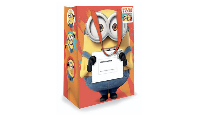
Minions would be a perfect example, which just took off immediately and is now an established evergreen license. This gift bag I designed used Bob’s hands to hold a card in place to go with the gift bag, which embraced innovation, offering newness and value for retailers.
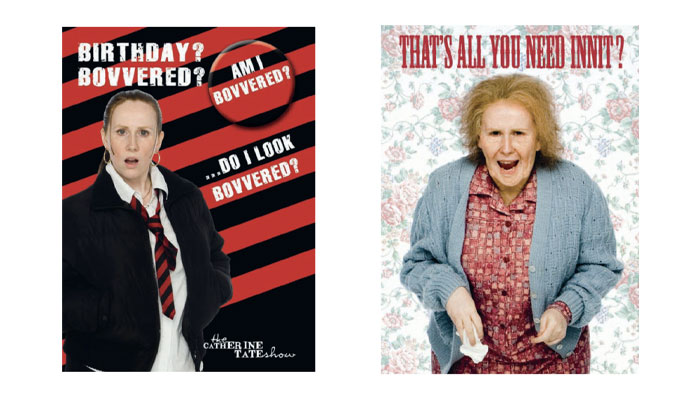
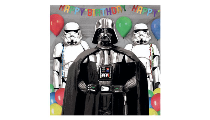
I’ve had the pleasure to work with the biggest brands in movie, TV, celebrity, music, gaming and sport – and occasionally something unexpected like The Annoying Crazy Frog… Or a TV comedy like Little Britain or Catherine Tate just takes off when phrases become part of popular culture.
And what makes a good licensed greetings card?
I would always say the more assets you have to work with, the better. It allows you to select a style that works best for independents, budget and the mainstream grocers. Then it would be good composition, typographic style and, depending on the license, writing a caption that delivers for that age, relation or occasion immediately. People don’t want to spend too long picking a card, so make it an easy send or purchase.
You also want to work with a licensee that trusts you and understands the creative and commercial requirements to make the product work at retail – and gives you the freedom to write captions in that characters style. Without this relationship, however huge a brand is, it won’t achieve the levels it should.
When designing a greeting card, how conscious are you of the intended recipient?
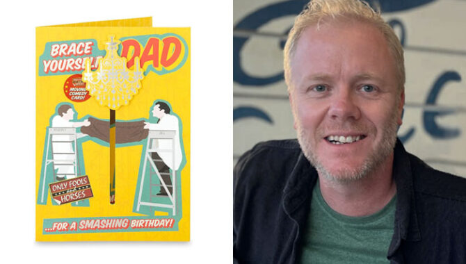
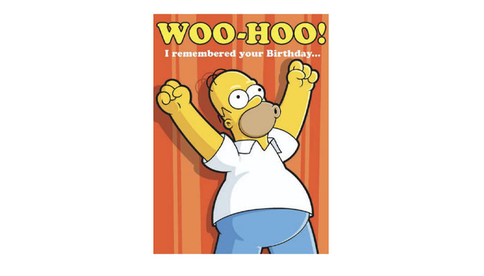
Very conscious. Each brand will have a core demographic of fans you want to appeal to, so you need to understand fully what they want before you start building a range. As greeting cards are never a self-purchase, you first need to appeal to the parent or grandparent to pick it off the selves. Captions also vary greatly for relations – a Homer Dad caption might be ‘The smartest Dad in our house’’ with more derogatory humour, where Mother’s Day overall would show more love and appreciation.
Do you look beyond the greetings card industry for ideas and influences in terms of card design?
Yes, there are many areas to be inspired by and so many mediums to explore. I think it was Paul Smith who said: ‘You can find inspiration in everything and anywhere’. It’s about having an open mind and sometimes re-imagining an older idea with fresh eyes. I’ve always kept a notepad next to the bed for those ideas that I might forget in the morning! It’s about keeping an eye on trends and understanding the direction of travel, or the mood of the nation, as much as anything.
A lot of your cards are available on Moonpig and Funky Pigeon. Design-wise, are there specific things you have to do to ensure a card works online?
Yes, you must remember the majority of people are now buying from a phone – so the design needs to work as a small thumbnail before people click and buy. Try to minimise the caption so it’s more immediate. And once you have that fantastic idea, do your research to ensure it has not already been published. However good your design is, no retailer wants another version of the same thing. The whole card is visible online and this gives you more flexibility with caption placement.
I also recommend trying to find a subject area that’s not being covered and create something to fill that gap. I noticed there were no football cards covering teams outside the top six, so created some generic designs which covered teams across all divisions – including your kids youth team. There was also a gap with basketball, american football and rugby.
What new trends have you grappled with in greetings cards in the last year or so? How are you incorporating these into your work?
The ongoing progress of AI image generation will grow and be more visible, but for now AI still can’t give you the creative ideas! The 6-7 craze was hard to avoid, but due to the speed to market it’s been more of an online card trend. Pets continues to grow year-on-year across general and occasions. I obviously follow design trends, but don’t necessarily look to follow them too closely as I am looking to build longevity in my ranges which I can expand and evolve over time – like sport, gaming and humour.
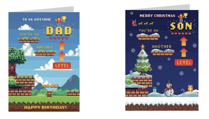
Retro gaming continues to grow in popularity, so I have created a generic 8-bit gaming range called ‘Another Level’ which is doing very well online across Seasonal, Birthday, Age and Relations. I am looking to demonstrate how this can work across other product areas for high street at PG Live show.
Terrific. What else do you have in the works for PG Live?
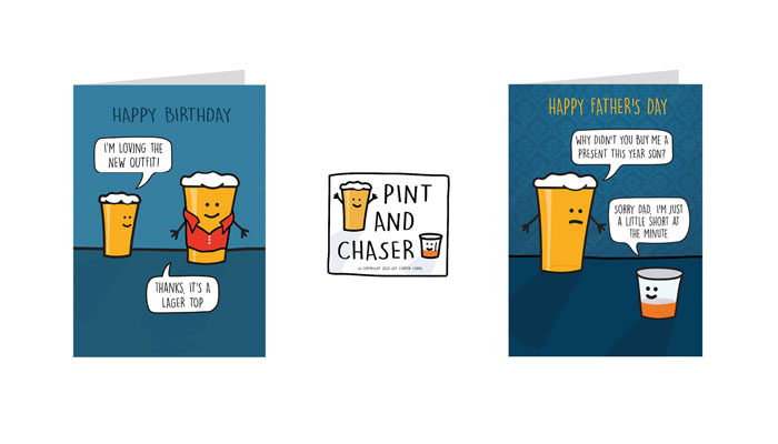
I’m working on several ideas and am yet to decide what ranges will be shown as we’re very limited on space in the newbies section upstairs… I will be showing a range called ‘Pint & Chaser’ which is about surreal or silly conversations between two friends who brew up together… A friendship that was ferment to be… Yes there’s a few puns!
Superheroes are increasingly popular and there’s a growing trend of people announcing, or celebrating their own superpower – be it a hobby, sport, personality trait or a more risqué send. I feel there’s an opportunity for this to cross over into other product areas and work well.
Thinking about brand owners not currently active in greetings cards, what should they be doing to get ‘card ready’?
Research high street and online stores to see the competition. Understand what demographic their brand appeals to and the retailer it might suit – or find the right publisher with existing retail relationships who you could license your brand to. Gather assets or a small style guide including logo, colour palette, images or illustrations to enable a publisher to create a range of designs. Even better, create a few examples using the strongest assets and demonstrate the editorial flexibility to create captions across birthday or seasonal designs.
Which greeting card collections and brands you would put in your all time top three?
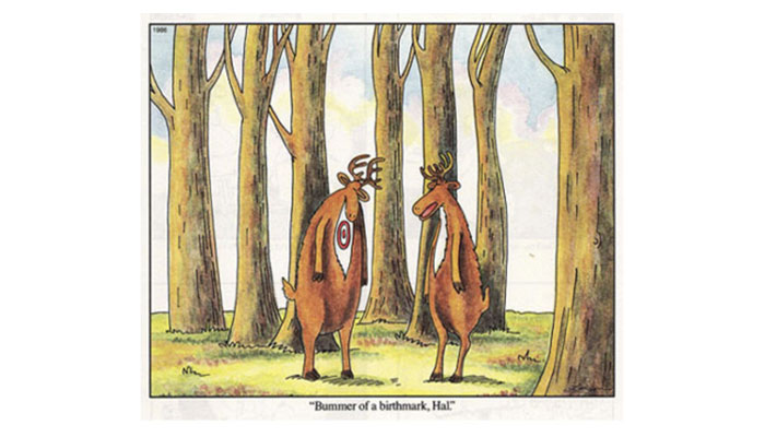
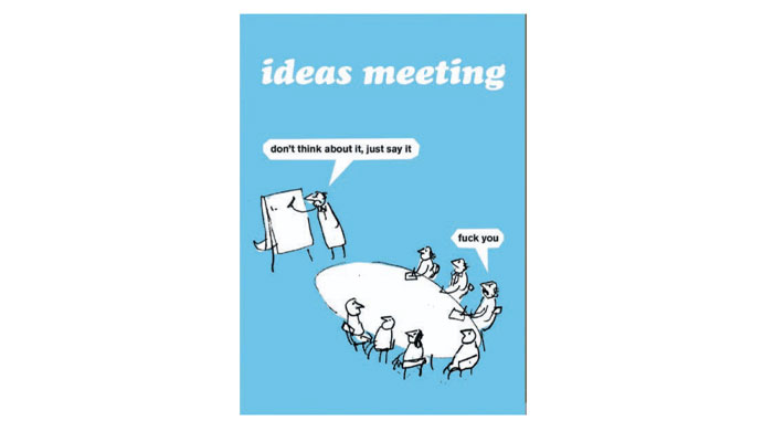
The ranges that made an impression on me when I first starting working in the industry would be… Far Side by Gary Larson. This was brilliant at taking a completely absurd visual idea and delivering a single line that made the joke land instantly – this cartoon is a perfect example of that kind of surreal observational humour.
Another pick is Purple Ronnie. Created in the early 90s by poet and cartoonist Giles Andreae, this was huge and stood out because it combined simple line-drawn characters and rhyming poetry humour with a tone that could swing between sweet, cheeky and slightly risqué. This mix made it work across romance, friendship and adult humour, which was quite unusual at the time.
There’s many more I could select, but one of my current favourites is Modern Toss published by BrainBox Candy. It’s pushed greeting card humour into much edgier territory, showing there was a strong market for sharp, irreverent comedy that reflected modern workplace and social satire.
Great picks! Thanks again Martin!

A light touch for the Dark Knight: Simon J. Smith says Batwheels has some of his career-favourite ideas…

“You cannot approach a brand like Kodak or Philips or Electrolux with a generic playbook”: As LMCA turns 40, we catch up with President and CEO Ciarán Coyle.

“The business has only grown because of the people in it – people who care about the work, challenge ideas and take ownership”: In conversation with Jason Knights, MD at Blue Kangaroo.

“Collaborating with incredibly talented artists is such an important part of what we do”: In conversation with Byron Williamson, License & Marketing Manager at Spike Leisurewear.

“In gaming, if you can’t adapt your IP to the visual and mechanical language of the platform you’re entering, you will fail”: In conversation with Elinor Schops, VP of Digital and Gaming at Miraculous Corp.

Kate Schlomann – EVP Business Development and Operations at Spiralcute – on what gives IP like Chiikawa, Mofusand and Koupen Chan licensing potential.
Receive the Brands Untapped Newsletter


Enter your details to receive Brands Untapped updates & news.