—-
To stay in the loop with the latest features, news and interviews from the creative community around licensing, sign up to our weekly newsletter here

“Brands are increasingly embracing gentle colour palettes, wholesome characters and positive messaging”: In conversation with Mima Creative’s Jemima Chamberlain.
Jemima, you work a lot in stationery and accessories. When we last chatted, you mentioned you look at the stationery market in Asia for inspiration. What recent trends have you noticed from that market?
Plush and soft-touch accessories are definitely having a moment. While plush products have always been popular with children, their appeal has grown significantly within the kidult market. When designing, I’m always looking at how a product can be elevated and made more exciting – and finishes such as plush fabrics, embroidery and padded appliqués are a great way to achieve that. You have consider whether those finishes feel authentic to the licence itself, but when they do, they can be a fantastic way of bringing the characters at the heart of the product to life.
Similarly, I’ve noticed a growing trend towards shaping products in ways that are instantly recognisable to fans. Whether it’s a 3D Cinnamoroll-shaped pen topper or a Pembe-shaped plush pencil case, these details create a stronger connection to the consumer and help products stand out on shelf.
Another trend I’ve noticed across the Asian market is the continued popularity of comforting, soft aesthetics. Brands are increasingly embracing gentle colour palettes, wholesome characters and positive messaging. This goes hand in hand with the growing focus on wellbeing and self-care – particularly among teens and young adults who enjoy romanticising everyday life.
Characters such as Molang and Miffy fit naturally within this trend, and it encourages me to think about how products can feel comforting and uplifting while still being visually engaging. Whether through colour, materials or product concepts, I’m always looking for ways to capture that sense of warmth and emotion within my designs.
We seem to be in the ‘age of the collab’. What are the secrets to success in ‘collabs’ do you think?
The most important thing in making a collaboration work is identifying the key attributes of each brand and understanding how they can naturally complement each other. If the values don’t align, it’s likely the audiences won’t either, and therefore it won’t be as successful.
A great example of cohesive branding was the Hello Kitty and Friends x Care Bears collab. The partnership worked because both brands share themes of friendship, kindness and positivity. Hello Kitty’s “You can never have too many friends” motto paired perfectly with Care Bears’ message of caring and sharing. The collaboration also paid close attention to character pairings, which made it feel thoughtful and authentic. I loved seeing Bad Badtz-Maru dressed in his grumpy bear costume!
How can partnerships ensure both brands are treated equally?
I think it’s important to think outside of the box. The strongest collaborations integrate the two worlds together rather than simply placing them side by side. Thinking back to the Hello Kitty and Pusheen collaboration, there were illustrations of Pusheen wearing Hello Kitty’s bow, and Hello Kitty dressed in a Pusheen costume, which made the collaboration feel balanced, while still being fun and playful.
I also think it’s important not to lean too heavily into one licence’s existing visual identity, but instead create something that works for both IPs equally. Developing a shared colour palette, complementary typography and product styles that blend both aesthetics helps the collaboration feel cohesive – while still celebrating each license individually.
Talking of collabs, you recently worked on a range featuring Molang and Smiley World. Can you talk us through this partnership and how it worked for you design-wise?
This is a great example of brand values aligning to create an ideal collaboration. Molang is known for their gentle kindness, while Smiley World is rooted in positivity, so the two sit together very naturally. Those attributes strengthen the shared message that “Kindness and happiness can make the world a brighter place.”
The style guide really encapsulates this idea. It uses a bright but simple colour palette and maintains a careful balance between Molang’s soft visuals and Smiley World’s louder compositions and patterns. The gingham accents and soft textures feel appropriate for both brands, helping to blend the design without favouring one over the other. The strong style guide and branding also helps when it comes to developing exciting product ideas that feel authentic, such as best-friend pair products, gratitude journals and cosy items.
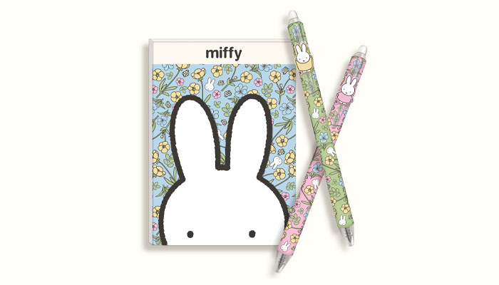
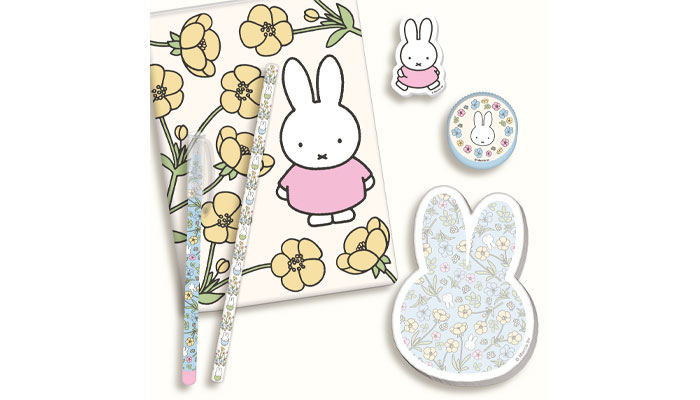
You have worked on a number of classic brands like Miffy. What attributes do you think brands like Miffy have that has kept them popular and relevant?
Any opportunity to talk about Miffy is a great one! Working with Dick Bruna’s original drawings helps keep the brand incredibly authentic, and the simplicity of the illustrations makes it highly adaptable to current trends while still retaining its core identity.
I also think the brand’s longevity comes from being genuinely evergreen. In today’s climate, people are increasingly drawn to brands they know and trust, instead of things that feel like passing trends. That’s where nostalgia comes into play. Many audiences have grown up with Miffy, so there’s a strong emotional connection, alongside a curiosity to see how the brand evolves.
Another strength is its appeal to all ages. For example, collaborations like Miffy x Little Dutch work beautifully for baby and nursery products, fitting alongside Miffy’s soft, innocent personality. At the same time, brands like Blueprint Collections, Skinnydip and Daisy Street create Miffy designs for Millennial and Gen Z audiences who grew up loving her, keeping the brand feeling relevant and exciting.
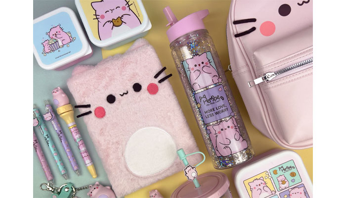
I noticed with Blueprint Collection’s Pembe the Pink Cat range, there was a lot of effort put into design details and finishes – for example, the plush pencil cases. As a designer, how do you add value to licensed products and ensure they stand out from the crowd?
The key is to always understand the brand DNA and the audience and then translate that into thoughtful products. It’s about thinking beyond the obvious ideas and finding ways to embed the brand into the details. For example, with a character like Pembe the Pink Cat, the fluffy, soft aesthetic naturally lends itself to plush finishes. That kind of choice feels authentic to the character, but it wouldn’t necessarily work for every brand.
Small, unexpected finishes can make a big difference. Things like designs on each page of a notebook, or MI zip pulls add a sense of discovery and elevate the product. Those subtle design decisions are often what make licensed ranges standout and impress the fans.
You have also worked with tonies. Can you tell us a bit more about this and what your role was?
I’m incredibly grateful that Sophie Bloomfield asked me to help create artwork for tonies, as it’s such an exciting and innovative brand to work with. At its core, tonies is all about inspiring children’s imagination and making learning fun through ears first storytelling and play. That ethos became a key consideration when developing creative assets for the brand.
It was an interesting challenge because, rather than focusing on a traditional character-led approach, we had to think about what makes the tonies experience unique and why someone would choose a tonies-branded product. That encouraged us to think outside the box, quite literally, and explore ways of translating the brand’s personality into visuals.
For our first project with tonies, we focused on bold simplicity, using strong block colours, clear shapes and confident typography to create standout brand moments. From there, I helped develop compositions and patterns that felt true to both the creative direction and the tonies brand itself. By combining phrases that felt authentic to the brand, with their signature cat-ear shape, we created designs that felt playful and stimulating. The use of overlapping graphics and typography helped introduce a sense of curiosity, energy and movement, reflecting the imagination and creativity that sit at the heart of the tonies brand.
Thinking about licensed products, how do you go about coordinating your design looks with other categories?
It’s always helpful to look at what other licensees are doing, particularly across different product categories, as this often reflects what fans are engaging with. Understanding how a brand translates into apparel or homeware, for example, can help influence the direction of new designs. Seeing the products of other licensees that are in development is also extremely useful, as it helps ensure consistency.
When a brand feels cohesive across all categories, it strengthens recognition and ultimately helps it grow. Capyfun is a great example, as the children’s fashion that is currently in store is insightful of how colour, character placement and editorial are being used. These kinds of references help identify what feels authentic to the brand in different product areas, and how that can be adapted.
Reflecting on style guides, if you could suggest one specific improvement to guides, what would it be?One improvement I would suggest is to include recommended fabrics and finishes, which I have found to be particularly useful when considering the final product. This gives designers a stronger understanding of the licensor’s expectations and helps to ensure different licensees’ products sit together on a shelf.
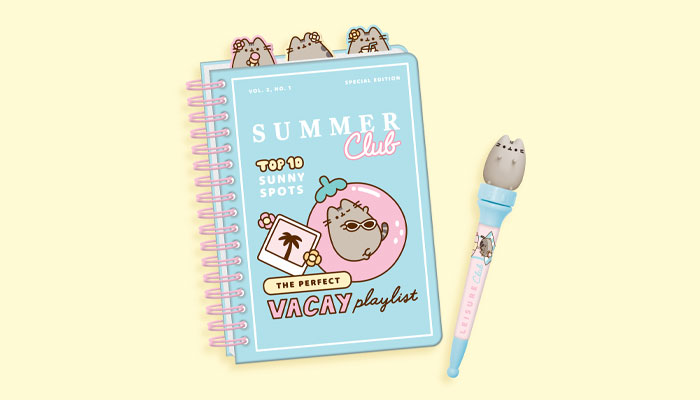
I first noticed the value of this when working on Pusheen, and I think it’s a tool that could benefit many other licences. Pusheen’s Tropical Vacation guide suggested materials and finishes such as jacquard terry, beach fringing and lightweight fabrics, which reinforce the summer holiday aesthetic of the range. In contrast, their Farmer’s Market guide suggests cotton canvas, gingham and embroidered appliqués, which feel much more rooted in the natural, slow-living and sustainable feel of a farmer’s market.
Having this material guidance makes it that much easier to understand not just the visual design, but also how the product should come to life, which in turn results in a cohesive overall range.
Great point. Now, last time we chatted you picked out three licensed products or collaborations you had seen in the market at the time that you admired. It was great to get this insight. What three products have you seen this year that caught your eye?
The Miffy x Wild collection comes to mind first! My best friend sent me a link to the range because she thought I would love it, which shows they have understood their audience. Miffy’s world is uncomplicated and kind, and with Wild’s commitment to natural and sustainable products, it feels like the brand values intertwine perfectly. Even the ‘Cotton Clouds’ fragrance feels carefully thought out, complementing the bubblegum-pink colour palette and illustrations of Miffy enjoying the outdoors.
Another collection I’ve admired is the collaboration between Good Squish and Arsenal Women’s Football Club. The entire range is compelling, but the bags stood out to me in particular because they feel so authentic to both brands. The combined logo lock-up is refreshing and distinctive while still respecting each brand’s identity. I also love the way Arsenal’s heritage colours and patterns have been paired with Good Squish’s signature ruffle detailing. It’s a brilliant example of capturing the emotion and community of football while celebrating the girlhood that is in the centre of both brands.
Finally, Sabrina Carpenter’s official merchandise consistently stands out because it feels genuinely product-led rather than simply throwing a name on a t-shirt. One of my favourite examples of this is the doormat, inspired by her song ‘House Tour’. It’s a clever interpretation of the music, transforming a lyric into a functional product that feels both relevant and fashionable, and shows that thinking beyond traditional merchandise can create products that fans genuinely want to use and keep.
“Jem is an artist – and what comes with that is touring, residency shows and other theatrical pieces”: In conversation with Matt Proulx, SVP of Global Experiences, Partnerships, and Music at Hasbro.

“What are your biggest fears?” Heather Antos – IDW’s Senior Group Editor – asks some surprising questions…

A light touch for the Dark Knight: Simon J. Smith says Batwheels has some of his career-favourite ideas…

“You cannot approach a brand like Kodak or Philips or Electrolux with a generic playbook”: As LMCA turns 40, we catch up with President and CEO Ciarán Coyle.
“The business has only grown because of the people in it – people who care about the work, challenge ideas and take ownership”: In conversation with Jason Knights, MD at Blue Kangaroo.

“Collaborating with incredibly talented artists is such an important part of what we do”: In conversation with Byron Williamson, License & Marketing Manager at Spike Leisurewear.
Receive the Brands Untapped Newsletter


Enter your details to receive Brands Untapped updates & news.