—-
To stay in the loop with the latest features, news and interviews from the creative community around licensing, sign up to our weekly newsletter here


“The usual method of putting a nice bit of the archive on a mug will only go so far”: Danny Heffer shares his tips for heritage brands looking to commission creative.
Danny, it’s great to catch up. As we’re halfway through 2026, it’s probably a good time to reflect on the way the market is shaping up this year. Thinking about your work and clients, how do you think people are finding things currently?
Budgets are definitely tighter, but the interesting thing is ambition hasn’t disappeared, it’s just become more focused. People are asking harder questions now. Five years ago, a licensing conversation might’ve started with: “What can we put on a mug?” Whereas now it’s much more: “What do we actually stand for?” That makes for much more interesting creative work.
There’s still a lot of momentum out there, particularly in heritage. I’ve been working with a lot of “new to licensing” museums and institutions who’ve watched the success of the big players and started looking at their collections – not just as archives, but as IP with cultural and emotional value. Heritage licensing is now established enough that simply having an archive isn’t the magic trick anymore. Everyone has beautiful objects… Everyone has a few Hokusais knocking about somewhere… The challenge now is finding the thing that makes your collection feel culturally specific and creatively ownable.
One thing I try to get across to clients is that competition in heritage isn’t really a zero-sum game. The opportunity is in carving out a distinctive point of view and finding the new thing your archive can represent.
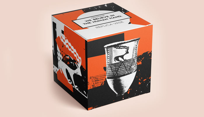
Talking of heritage, I know you have recently worked with The Ashmolean Museum on some new design assets. The Human Hand theme you created is very different and a new move for the Ashmolean. Can you tell us more about this project?
I loved working on this project. Dec and Carrie at the Ashmolean are dream clients. They’re creative, thoughtful and willing to question everything. On top of that they’re seriously passionate about the Ashmolean and its collections. They came to me with some pretty deep questions. They had a world class collection of objects, spanning thousands of years of history. How do you represent that at a licensing level? How do you set it apart from the other IP out there? What is the Ashmolean design ethos? What’s their creative lens?
Because of the cultural and historical context in which they’re made, British museums are going to have relatively similar collections. Everyone has a bit of Morris, a few tapestries hanging around, a cast court or two. So how do you make the design distinctive enough that it’s ownable whilst respecting scholarship? At some point we had a collective brainwave. Everything in the museum collection had been conceived, designed and made by a human being. That’s a really powerful concept. At the moment there’s a real cultural appetite for the human over the automated. We’re all worried about the effects of AI on creativity and how it’s being used so the human hand becomes something to be celebrated.
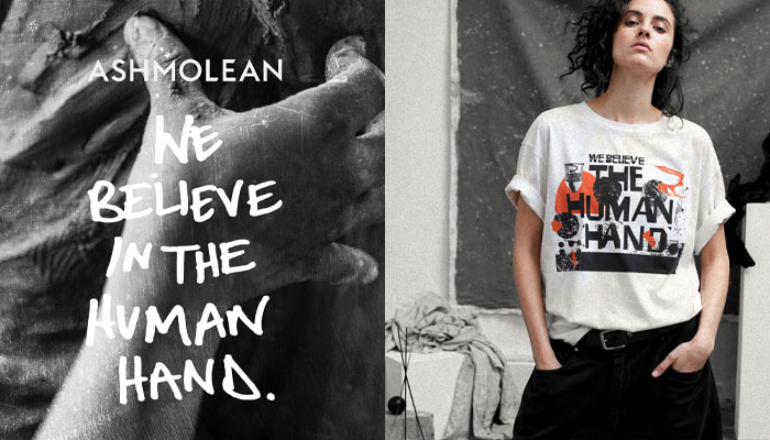
I came up with the statement “WE BELIEVE IN THE HUMAN HAND”. The heft and might of this felt like a rallying cry for designers which then led on to a manifesto of sorts centering around the idea of celebrating the human signs in design. The thumbprint, the ink stain, the brush mark… Imperfection has a beauty that is inherently human. This focused into a design style that took these marks as a starting point to build up ‘inspired by design’. Surface pattern and material all play a part in celebrating the tactility of a physical object made at a human scale.
It gives, I think, a really distinctive look and feel for the Ashmolean. The manifesto gives a clear design steer to licensees to be able to create new and ownable design based on the collection.
Terrific! You have also been working with The Royal Entomological Society, who are new to licensing. How do you help brands to get started with assets for licensing?
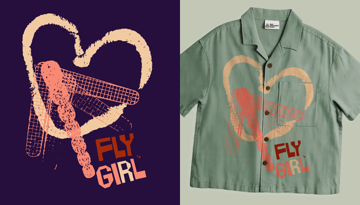
Yes, again an institution in need of a unique offer. Their contemporary work is about understanding and developing insect science. They also have an archive of illustration and prints going back into history. The archive is a rich, scientific and historic resource which has been interesting to delve into creatively in order to extract different storytelling themes that further enhance the RES’ unique creative fingerprint.
Nikki Beckett has been engaged by them to recruit new partners and licensees and so we worked on a concept to story tell around underrepresented nocturnal insects and celebrate their often-forgotten beauty and positive contribution to our lives, pollinating in the night shift. Insect and plant life are very active in the night hours and the garden comes to life in all its sensory glory. This is a gift for design as it’s so visually distinctive. I came up with a rich, deep hued set of design assets that conveyed sense, scent and drama. A new look for the archive that sets them apart from the rest.
I think with these projects it’s really important to give licensees a reason to work with the IP holder. You have to answer the ‘Why?” question and I think being bold, innovative and distinctive in design does that.
Beyond talking to your clients about their objectives, how do you make sure you are ‘match ready’ when taking on projects like this?
The usual process is archive dive, retail audit, audience mapping, competitor scan, tone-of-voice check… That kind of thing. At the point of contact with me, clients are usually fairly entrenched in the project so it’s important to bring a fresh pair of eyes that have a broad overview of the industry. Working with a client base across toys, license, immersive and heritage is really important. It helps to bring learnings from one part of the industry to the next.
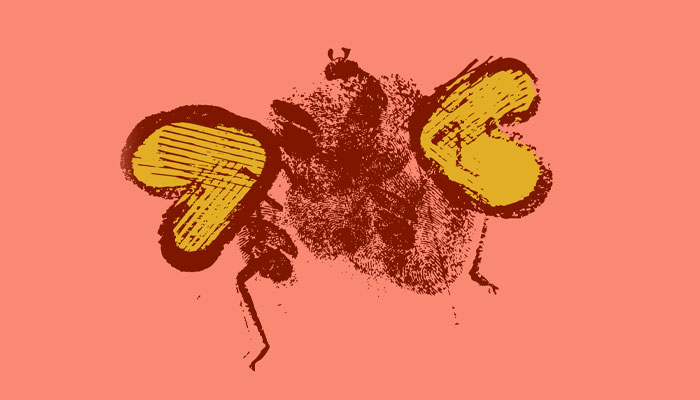
In terms of keeping creativity up to speed and fresh, I try to look at design outside of the industry as much as possible. Consumers don’t see a licensed product on the shelf they just see something that appeals – so I think we need to speak that global design language. Recently I’ve been experimenting with escaping the vectors. I did a cool mini project with the RES using inky bug prints I’d made with my kids. Fresh work. Sadly my mini design team is asking for a heavy royalty so it’s a loss leader.
You are building up a great portfolio of clients and work in the heritage sector. What general advice would you give to a heritage brand looking to commission design work based on their archives?
Be unique. It’s really important in a growing market to carve a niche and give licensees a reason to work with you. The usual method of putting a nice bit of the archive on a mug will only go so far. Collections need to find a design process that interprets the collections in a way that becomes part of their brand. In a heritage context, it’s important to respect the object and maker – so don’t ignore that initial thought process that gives a strong philosophy behind it all.
And I understand you’re also working with The Royal Armouries too?
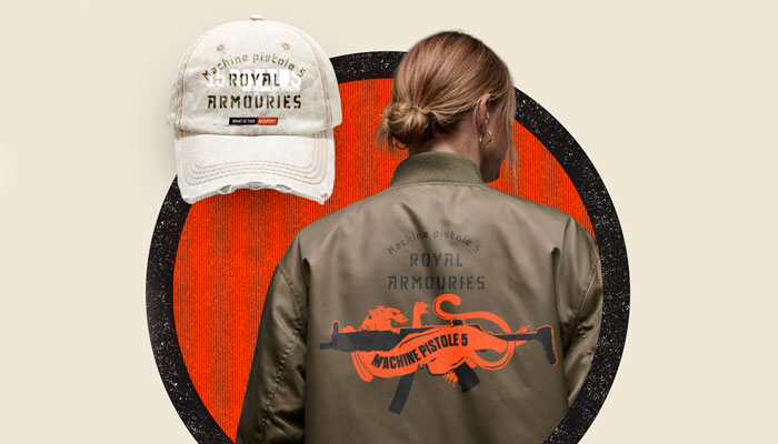
Yes – another relatively new to license client. The Royal Armouries are looking to build on a huge YouTube audience that has built around their series “What is this Weapon”. They’ve got more than 420k subscribers and are still growing so a willing and interested audience is there. A big part of the work with the RA was to define the audience. It’s easy to think the YouTube audience is mainly teenage gamers, but there’s also a strong following of collectors and history buffs out there too.
Arms and Armour is a sensitive subject. We wanted to get across that each object is part of a bigger story about conflict, craftsmanship, innovation, culture and human behaviour. It’s not just about things that go bang. Design centered on bringing out data and detail – something we know that their audiences love.
You spent a number of years at Aardman creating assets for brands like Shaun the Sheep and Wallace & Gromit. Thinking about the character brand market, what trends have you seen coming through strongly this year?
There’s been a huge influence from East Asian character culture, particularly around collectability, emotional design and stylised cuteness and that has by far been the biggest design change I’ve seen in years. My local research hot spot is Cardiff – the shops that seem to be thriving are all selling Japanese, Korean and Chinese IP. I’m seeing European brands starting to make themselves appeal to that audience both here in the UK and also over in the Far East.
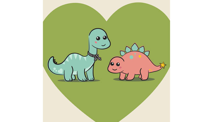
I’ve been commissioned recently to design some dinosaur characters for The Natural History Museum. Dippy and Sophie were briefed to have appeal to the Chinese market and to capture that cuteness that works so well out there.
On that, being a UK based designer, how do you ensure your work has international appeal?
Humour, colour, symbolism and product formats don’t always travel cleanly. So it’s really, really important to listen to local advice and not rely on your own taste. Luckily, I’ve always worked with strong teams in Japan and China. It’s the one area of design where you actually want someone to say: “That’s not right for us”. That’s often a difficult ask for a Far Eastern design team but the skill is drawing out the criticism and doubt and refining it back into a better product.
For me, typeface choice has always been a tough process. It’s so baked into our respective cultures that it’s hard to accept the others’ preference. But that you must. It’s about respecting others’ better knowledge and understanding their eye is more in tune than yours. As a designer that’s a really tough task but over the years I’ve learnt to trust the process.
A well-trodden route in character licensing is ‘collaborations’ between well-known brands. In your view, how do you make the most of opportunities like this?
I think the best ones create a third thing. It’s not about ‘brand A’ being pasted onto ‘brand B’. it’s about creating something new and unique. I worked on a lot of collab projects at Aardman and was mindful to be very loose with our creative interpretation. Both brands need to be open to the other’s ideas and design style. Fans want to see what the outcome of the process is, that’s part of the fun. It gives unexpected results. With character in particular it’s easy to get caught up in worrying about the ‘world’ and the rules, but these things exist in a liminal space and rule-breaking is part of the process.
I also think the best ones lean into the inherent silliness and absurdity of it all. “Yeah we’re all cashing in but look how cool it is!” Crocs do this really well. I loved their LEGO collab. Balenciaga too, I mean Crocs X Balenciaga – who wouldn’t want to see that? The anticipation almost outdoes the reality. So although the absurdity or unlikeliness seems odd, it drives the pre-release marketing and gets tongues wagging. So a sense of humour also helps.
Sometimes it is easy to be a follower. How does the licensing industry retain an element of boldness, individuality and flair in design?
The Ashmolean project is a good example of jumping the fence and going in a bold new direction. I think that came from the thought process at the start of the project. If we’d leapt straight into imagery then the visuals would’ve pushed us into a taste led exercise I think. It would look good but wouldn’t have felt new. We spend a lot of time making things look nice, which is fine, but to create something new and innovative you have to have a strong foundation.
The Ashmolean team spent a lot of time thinking about where they wanted to be in the market, what their ethos was, how that stood with their peers. This to me felt that it mitigated the risk of doing something so radical. They’d done the heavy work and had answers for anyone questioning the process. It was a thought through idea with a clear concept and vision.
Finally, what licensed products have you seen this year that have caught your eye as great examples of licensing?
A great example of what I’ve been talking about but didn’t do was the greetings range that Oh Deer did with the Natural History Museum recently. Using old archive material but adding in riso-inspired day glo colours looked fantastic and made me think “I wish I’d done that”. It respected the archive while still feeling contemporary, which is exactly the balance great heritage licensing should aim for. Well done to them, really lovely work.
Great pick! Thanks again Danny!
Start Licensing’s Ian Downes discusses industry twists and turns with three of his former colleagues from Copyright Promotions – Simon Gresswell, Andrew Levy and Daniel Avener.
Jack Fox, Sales & Marketing Director at Rubber Road, talks TUBBZ Mystery Eggs – and why Minions were a perfect fit.
Spin Master Co-Founder Ronnen Harary talks to us about his exciting new book, working with inventors – and Spin’s most underrated launch.

How Speed Arena: Race in a Case became an instant hit: in conversation with Carrera Revell’s Frank Tiessen.
“I guess I never really grew out of it…” Barry Eldridge onwhat makes a license right for Factory Entertainment.

“A good collectible used to be about likeness, now it’s more about interpretation”: In conversation with YuMe Toys’ Gurdeep Bains.

Receive the Brands Untapped Newsletter


Enter your details to receive Brands Untapped updates & news.