—-
To stay in the loop with the latest features, news and interviews from the creative community around licensing, sign up to our weekly newsletter here

Dario Spallone, CEO and Founder of D1 Milano, discusses his design-led approach to smart brand collaborations.
Since launching in 2013, watchmaker D1 Milano has embarked on exciting collaborations with the likes of Warner Bros and Perfetti Van Melle to create high-quality licensed products that have a “conversation starter” quality.
We spoke with Dario Spallone, CEO and Founder of D1 Milano, about the firm’s design-led approach to partnerships with brands like Gremlins, Metal Slug and Chupa Chups.
Dario, it’s great to connect. To kick things off, how would you describe D1 Milano’s approach to design?
We work on pieces that are conversation starters. Usually, the industrial watch landscape has been very conservative and traditional – brands worked on logical axioms and categorisations were very rigid. If you had a certain movement or a certain material, that was the price range that you were belonging to.
“These collabs have to have a soul. It’s not only about putting a brand name on the dial that makes the product.”
Our approach was different. We said: “Let’s not think about categories, let’s think about what the highest possible perception is for a product that sells at that price” – irrespective of the categorisation. That’s why we work on very specific quality details that give an overall aesthetic that’s very different from our competitors. We work on those details that people may not perceive because that’s what makes us different.
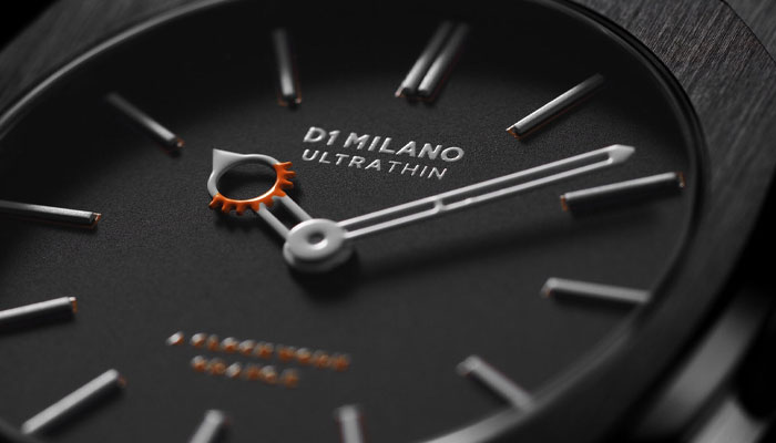
These details create the character of our watches. This is why we say we work on three pillars: Quality of Materials, Chromatic Innovation and Character.
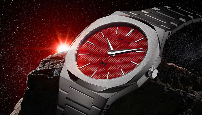
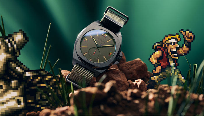
Last year saw D1 Milano launch quite a few licensed watches, spanning brands like 2001: A Space Odyssey to Metal Slug… What do you look for in a brand to work with?
We work with brands that we love. When you love a brand, because maybe it has been part of your childhood or you find it cool, then you can really make something that doesn’t look only like a ‘marketing stunt’.
We work with brands that have their character, but whose character can also be transposed to what we do as well. These collabs have to have a soul. It’s not only about putting a brand name on the dial that makes the product. The product is details at 360 degrees; these details can be coherent if – and only if – there is a clear reason why behind it.
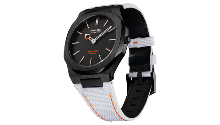
Let’s dive into some of these collabs… One that launched last year was A Clockwork Orange. It’s a really stylish brand extension, so what did the first few creative steps look like when designing this piece? How did you land on focusing on the eyelash motif?
Well, who doesn’t love Kubrick? That was the reason behind this collab, and our 2001: A Space Odyssey launch. Kubrick has a beautiful photography; that’s what inspired us to do this edition. Just think of how many people have a Clockwork Orange or a 2001: A Space Odyssey poster in their homes!
“When you love a brand, then you can really make something that doesn’t look only like a marketing stunt.”
From there, we went to create a mood board around the elements that constituted the main image of Clockwork Orange. For us, it was the eyelashes and the white fabric of the prison’s detainees, as well as the classic suspenders and the iconic milk. Well, after this it was easy! We just said: “OK, we have all these elements, how do you put them in a watch?”
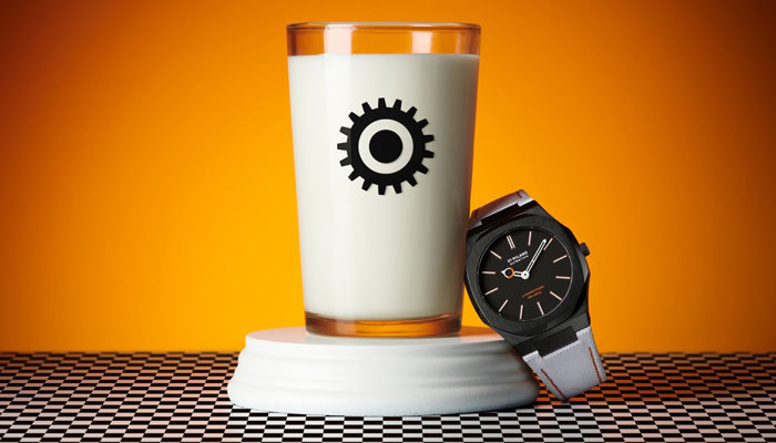
Every detail had to fulfil its role… The hands were inspired by the iconic eyelashes motif, the crown was inspired by the hat, the strap was made with the same fabric touch and feel – as well as the colour white – while the whole communication played on the milk and orange theme.
The hard part was getting the mash-up to work as a single piece, a symphony. I personally think the result was quite nice.
So do I, it looks fantastic. Sticking with iconic movies, you also launched a Gremlins watch last year, and that also has some lovely design touches.
Since I was a kid, I loved Gremlins. I don’t know why but it was one of those films that stuck with me! My love was for Gizmo… Actually, I wanted to call my first pet Gizmo. It was a Persian cat that resembled the character, but I ended up calling in something more mainstream!
When Warner Bros asked us if we were interested in an ad hoc product, I was happy. Gremlins has that retro vibe and that’s what we wanted to take out from the collection. The theme of the watch was to recreate all the ‘rules’ that you were supposed to follow to have a Gremlin.
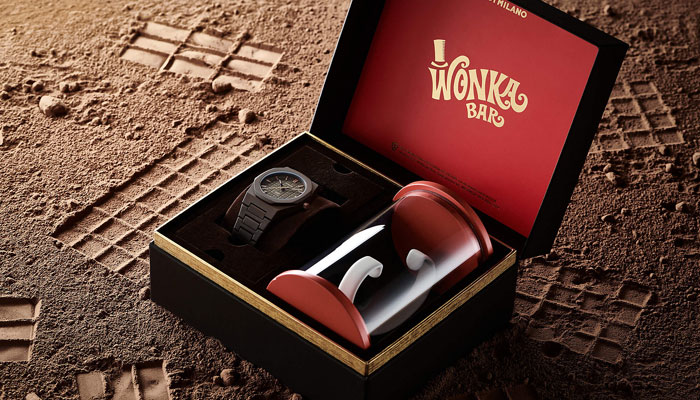
Yes! ‘Never feed them after midnight’ – midnight is highlighted in red. ‘Don’t get them wet’ – there’s a water droplet engraved on the crown. ‘Keep them away from bright light’ – the watch comes with a flashlight. Fun touches. You also launched a Willy Wonka watch last year. Talk us through the creative process for that one.
Well, the Willy Wonka & The Chocolate Factory movie has been an institution for generations and so is ‘the golden ticket’ and ‘the Chocolate Factory’. Starting from these elements, we decided to reinterpret our monochromatic icon by infusing chocolate essentials, shapes and colours.
But also, in order to evoke the emotions of the factory visit and let the magic happen for our customers, a few of our watches were released with a golden case back. The lucky winners who received one of these got a special gift delivered to their home. Last but not least, have you noticed how the watch packaging brings the customer to have a chocolate bar unboxing experience?
Yes, another great touch! Moving away from movies, your most recent launch is a Chupa Chups collection. What appealed about working with the brand?
Chupa Chups is one of those brands everyone knows; it has been part of our lives since our childhood. What really struck me about Chupa Chups – and made me decide to do this collab – was when somebody told me that the Chupa Chups logo was designed by Salvador Dali. That’s when I thought: ‘Woah, this is really a conversation starter!’ Everyone recognises the iconic logo, but do they really know how much art and quality was behind it? I personally didn’t, and I thought that was super cool.
To be a world-renowned brand like Chupa Chups, you need to have a very strong identity, and as well as being a wonderful product, Chupa Chups has a very strong graphic identity. We loved both, so why not try to work on a statement piece?
Talk us through the design of the range. How did you go about capturing the essence of the Chupa Chups brand?
Chupa Chups shows us that quality is simplicity. And simplicity is not easy. To do something simple and well takes much more effort and commitment than doing something complicated.
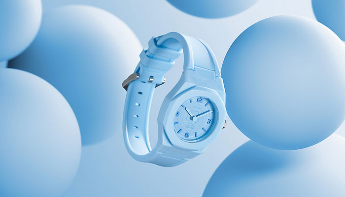
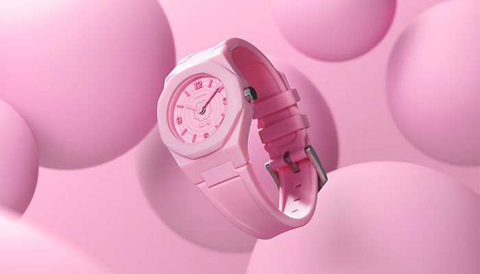
With this range, we wanted to do something simple, but at the same time create something with character. This is where the monochromatic touch – which is part of our DNA – came to place. The flavours of Chupa Chups bring us immediately to a specific world, and we visualised three colours that for us represented those flavours.
Then we created a whole graphic world around it, trying to bring a bit of this world – made of art, let’s remember Dali! – in our watches. I think they came out pretty well, what do you say?
I’m with you; a really impressive range. Dario, I’ve already taken up lots of your time already, so I only have one last question – what do you do to fuel your creativity?
I look around. At the end of the day, if something strikes you, it means that ‘something’ has something more. And that’s where we do the research.
We first let our emotions guide us… Our conversations, our online searches, our life experiences and so on. Then, when something strikes us – cutting through the excess of information that we are bombarded with every day – that’s when we try to understand the reason why. And we work to transpose it to what we do every day.
Great stuff. Thanks Dario; let’s catch up again soon.

Royal Armouries’ Senior Licensing and Partnerships Manager Jack Wanstall on the past’s future deals.
Stephanie Milton, Publishing Director for Bonnier Books UK’s Studio Press imprint, on why licensed titles have an advantage at retail…
The team at Juiced talk briefs, client relationships – and working on Sonic.

From Todd Snyder to tonies: Katie Huber – Senior Director of Licensing at Fred Rogers Productions – discusses new partnerships.
“How can we evolve style guides?”: Stacey Bates-McCue, Licensing Director at Fluid, on innovation, fandom – and PAC-MAN!
“The look, the design, the audience, the messaging… It all appealed”: Nico Blauw reveals what made Pembe the Pink Cat a winner for BOTI.
Receive the Brands Untapped Newsletter


Enter your details to receive Brands Untapped updates & news.