—-
To stay in the loop with the latest features, news and interviews from the creative community around licensing, sign up to our weekly newsletter here



“Kawaii feels like it’s just getting started”: Independent creative Danny Heffer reports back from recent trips to London Toy Fair and Spring Fair.
Heffer was recently on the hoof and I’d thought I’d chew the cud with you and share some ruminations on the fairs this year…
A perspective shift for me has come from attending these fairs standless, as a visitor rather than an exhibitor. It’s a subtle but significant change in mindset, and one that immediately alters how you experience the show floor. Without the pressures of being on a stand you’re free to observe more closely, nosey around and notice the conversations happening between the aisles rather than on the stands themselves. That change in position brings certain issues into sharper focus, many of which I hear recurring in conversations across the industry.
One of the most prominent is the ongoing debate around the value the design industry brings to trade fairs. Designers and creative studios are intrinsic to this ecosystem – we provide the creative spark that fuels product development, brand storytelling and, ultimately, commercial success. Our ideas are the inspiration behind much of what is being showcased, licensed and sold on the show floor.
What becomes clear when attending as a visitor is that creative businesses are not peripheral to these fairs – they are actively sought out. Exhibitors want fresh thinking, new perspectives and partners who can help their brands evolve. The demand for design expertise is there, sometimes more so than the infrastructure currently reflects. I certainly feel like a poor cousin, as a one-man agency I’ll never have the budget to take a stand – so for me, I’d really like the fairs to actively showcase our wares and recognise our value. Brands Untapped and Mojo Nation have been leaders in this respect so hats off to them, but I’d really like to see some support from the fairs themselves.
“I saw a strong lean into acid bright, neon colourways.”
For one, I’d really appreciate some simple stuff like meeting areas and decent Wi-Fi. Everyone needs this surely? Olympia was a real struggle this year. After the comparative luxury of ExCel’s main street it felt like Olympia was really under provided. It’s a delicate balance, I get that we’re seen as small fry and don’t have the budgets but we are a vital bit of the fair experience.
Getting off my soapbox, I jumped in the car and headed up the M5 to a wintry NEC for this year’s Spring Fair. I’ve been doing a lot of work recently in the heritage sector and I was on the lookout for some trend inspiration.
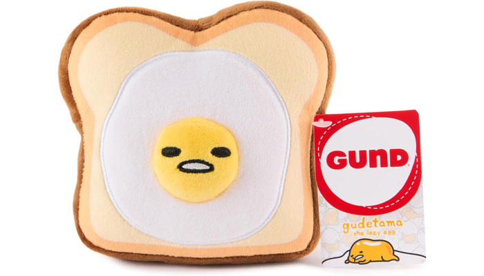
The first obvious thing to jump out was how much Kawaii character was on show. I’ve heard some say the fad is over but to me it feels like it’s just getting started. With so much in the market I think the cream will start to rise to the top quite soon. There’s a lot of generic character brands out there and little that stand out as unique. What Japan does well is give birth to the niche and unusual. Gudetama is a good example of this. An egg. That’s it. It’s funny, cute and quirky and stands out in a crowded field. For these brands to have longevity the need to carve a niche for themselves.
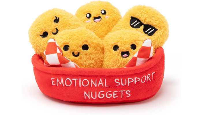
The second thing I noticed was the increase in Mental Health as a product feature. It’s starting to become used in lots of different ways, from comforting plush to board gaming. From a design perspective, it’s interesting to see how designers represent ‘feelings’ in design. It often comes down to creating a design language that represents emotion.
As an aside, I was in a revamped Holland & Barrett store in Cardiff recently. They’d created a whole language of shapes and symbols to work with their wellbeing products. This carried through from store design to shelf labelling. Nicely done, go check it out!
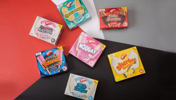
Thirdly I saw a strong lean into acid bright, neon colourways. I think, derived from the recent trend for Risograph printing. The V&A had a really interesting and fresh take on their Victorian pattern archive, replacing traditional colour with some eye-popping new colourways. It looked fantastic and I loved the design thinking behind it. Reusing existing assets in fresh ways is budget friendly and an excellent way of expanding a range.
“The demand for design expertise is there, sometimes more so than the infrastructure currently reflects.”
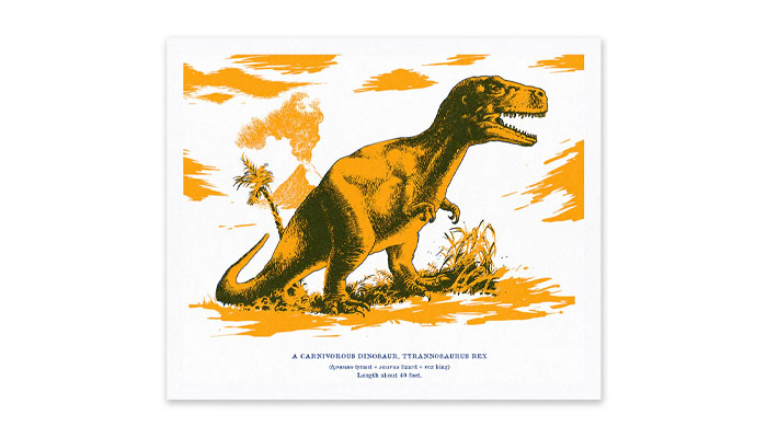
Passing the Oh Deer stand, I leafed through the Natural History Museum’s new range of riso-inspired cards and prints. Again, day-glo colour applied to older retro prints. It looked roarsome. By working in this way, the V&A and NHM are opening up new markets and new audiences by giving their products the zip and zing to be able to compete with modern design ranges. They can retail in much broader stores and bring a cooler, younger audience in. Good stuff for everyone.
Lastly, an under reviewed subject but for me the most important, The Cornish Pasty co. won catering stars for a hot sausage roll I scoffed, sat on the floor – again! – in between meetings. So much tastier than a freezing cold avocado wrap. Hooray for the NEC. And with that, covered in crumbs and shining slightly from the grease I stepped back out into the sleet and snow and headed home. Shows done. For another year…

Meredith Counts, VP of Creative at Jewel, looks at why joy is no longer just a feel-good footnote – but a business strategy in which licensing can thrive.

Licensed Ltd’s Paul Bufton puts ‘Original Gamers’ in the spotlight – and looks at how brands can best engage with this exciting audience.
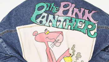
Creative Director Sophie Bloomfield looks at how archived IP can enjoy new life at retail.

What’s the verdict on the Science Museum’s Star Trek Warp Trail partnership? “Fascinating” says Deej Johnson.

As London Book Fair 2026 closes, we find some licensed titles among the stuff we love…

From games and TV shows to lost movies and more: the hit-and-miss licensing of Spy vs Spy.

Receive the Brands Untapped Newsletter



Enter your details to receive Brands Untapped updates & news.