—-
To stay in the loop with the latest features, news and interviews from the creative community around licensing, sign up to our weekly newsletter here


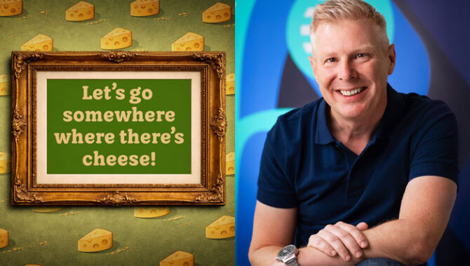
“You’re shaping something practical, but it still has to carry personality”: Talking typeface with designer and lettering artist Jamie Clarke.
Jamie, it’s great to connect. What encouraged you to specialise in typography and lettering?
Typography and lettering was a passion I discovered years earlier at college, but it went into hibernation while I was working in web design. In the early days of the web, typography options were extremely limited – if you wanted your design to display accurately you were basically choosing between Times or Arial.
As web typography improved, I started a blog called Type Worship, where I scrapbooked and wrote about typography I loved. It unexpectedly grew to over 200,000 followers and brought me into contact with letterers and type designers who were very encouraging.
That momentum gave me the confidence to specialise fully, and I went on to study type design at Reading University. It felt like moving from being a generalist designer to focusing on the craft I enjoyed most.
You work with a range of clients to create custom typefaces and ownable fonts. What drives brands to think about creating their own typefaces?
There are usually several reasons to commission a typeface, and once a client sees more than one benefit it becomes a very natural decision.
The main driver is tone of voice. Typography appears everywhere a brand communicates – advertising, packaging, websites, social media – so having a custom typeface allows them to express a consistent personality across all of those touchpoints.
Cost can also be a factor. Licensing an existing type family across a large organisation and multiple media can become expensive over time. Other reasons might include language coverage, technical requirements, or the simple desire to own something distinctive that competitors can’t easily replicate.
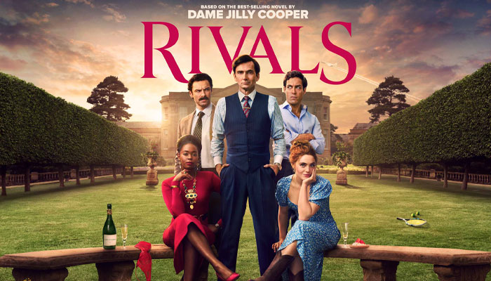
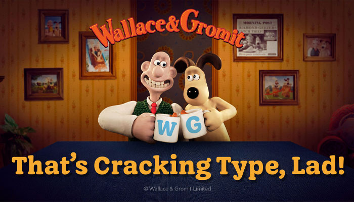
You have recently worked with Aardman to create a custom typeface for Wallace & Gromit. ‘Buttered Crumpet’ seems to have been very well received. Can you tell us more about this typeface?
Aardman approached me with three classic requirements: they wanted a typeface that spoke with their unique tone of voice, they wanted to own it outright rather than pay ongoing licence fees, and it needed to work in very specific environments, including within their animations.
We began by looking at existing typefaces that captured some of the qualities they liked and discussing which felt most Aardman in character. From there I developed some key letters and words, and we gradually shaped the design together. We knew we’d got it right when every time we looked at the letters, they made us smile.
Talking about briefs, can you give us a few pointers on what you like to see in a brief?
The most important question is always why. Understanding what the typeface needs to achieve is key. For example, a typeface I’m currently designing is intended for headlines and titles, but any text set in it must form a very neat rectangle so that other elements – imagery and supporting text – can align with it precisely in a structured layout.
Other important factors include who the typeface is speaking to, where it will be used, and any technical requirements. The clearer those goals are at the start, the easier it is to design something that genuinely fits the brand.
As well as working for brands, you have created and licensed your own library of typefaces. How does this part of your agency work from a creative and licensing point of view?
I almost always have a typeface of my own in development. Creatively, it allows me to explore styles or tones of voice that feel missing, even among the thousands of fonts available today. I enjoy finding a niche and giving designers a new way to express themselves visually.
These projects can take many months to complete and often include hundreds of characters to support multiple languages. Once released, the typeface becomes part of my library and can be licensed by designers and brands around the world.
From a licensing perspective, fonts are quite versatile products. They can be licensed for desktop use, websites, apps, broadcasting and more, which means a single design can end up being used across a huge range of projects and industries.
Can you highlight a few of the typefaces you have created and licensed?
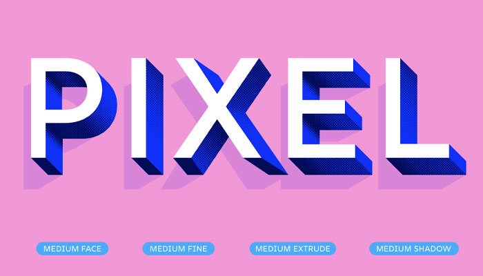
Early in my career I became known for eye-catching 3D display typefaces like Brim and Rig, designed for bold headlines and posters. Once a few well-respected designers started using them, word spread quickly and they’re now used by hundreds of thousands of designers worldwide.
Another typeface, Span, was inspired by sculptural stone inscriptions. It’s probably my most widely licensed design and works particularly well in elegant or refined settings where designers want to evoke quality and timelessness.

Do you have a set process for creating a new typeface? How important are trends to all of this?
You do need an awareness of design and cultural trends in order to create a typeface that speaks with a relevant voice. However, chasing fast-moving trends can be difficult because typefaces take time to develop.
For me, it starts with a strong brief that defines the aspirations for the design – not just its tone of voice, but also how it needs to perform at different sizes and in different environments. From there the process becomes quite methodical: developing key letters first, testing words and spacing, and gradually building the full character set until the whole system works together.
Where does a typeface designer find inspiration?
Inspiration can come from almost anywhere, conversations with other designers, galleries, nature, advertising, old signage… All of these influences tend to percolate over time. Eventually they feed into what is actually quite an abstract but functional design – one that, when successful, manages to capture a particular mood or feeling. That’s the interesting challenge with type design: you’re shaping something very practical, but it still has to carry personality.
I noticed that on your website you highlighted the book cover designer Margaret Armstrong as a creative influence. What do you like about her work?
Margaret Armstrong was one of the first designers to really treat the book cover as an art form. Her Art Nouveau-inspired covers still feel remarkably fresh today, even though many were designed more than a century ago.
“Span was inspired by sculptural stone inscriptions – it’s probably my most widely licensed design.”
Although her designs often feature plants and organic forms, there’s also a strong sense of symmetry and restraint. The balance between decoration and control really appeals to me. Her work is a reminder that typography and ornament can be both expressive and disciplined at the same time.
Are there any other designers that you would highlight that have influenced you and your work?
Absolutely, there are so many it could easily become another article. William Morris is a huge inspiration for his extraordinary pattern work and commitment to craft. Herb Lubalin’s expressive typographic mastheads are another favourite, and Reynolds Stone’s delicate engraved lettering is simply beautiful.
Alongside those historical figures, there are plenty of contemporary designers doing wonderful work too. Someone like Martina Flor has done a fantastic job championing lettering while also helping educate and support the wider design community.
Is plagiarism and copying an issue in the world of typefaces and fonts?
Typography has always evolved by building on earlier designs, continually redefining the alphabet. Many typefaces belong to long visual traditions, so reinterpretation and influence are a natural part of the discipline.
That said, direct copying of contemporary designs is generally frowned upon within the design community. Most type designers aim to contribute something new, whether that’s a fresh interpretation, a new technical approach, or a novel solution within a familiar genre. In practice, the industry tends to be quite good at recognising originality. Designers, clients and distributors quickly notice when something feels too close to an existing design.
And finally, if you were opening the doors to the Typeface Gallery, what are the first three typefaces you would feature and why?
Ah, that’s a tough question! Let’s see…
Gotham – Tobias Frere-Jones with Jesse Ragan (2000): For a clean geometric sans serif, it brings an authoritative but compelling tone to almost any message. Text set in Gotham always looks considered and confident to me.
Futura – Paul Renner (1927): Still remarkably fresh nearly a century after it was designed. Its clarity and optimism make it one of the most enduring modernist typefaces.
And perhaps I could be slightly immodest and include one of my own for fun: Rig Shaded, my award-winning 3D typeface. It introduced a new way of shading letterforms and was developed with the help of several colleagues, including a 3D designer who modelled the lighting.
Jamie, thanks again for making time!

“I guess I never really grew out of it…” Barry Eldridge onwhat makes a license right for Factory Entertainment.

“A good collectible used to be about likeness, now it’s more about interpretation”: In conversation with YuMe Toys’ Gurdeep Bains.
“I look at a plug socket and my brain turns it into a character!”: In conversation with Furry Puppet Studio’s Zack Buchman.

Illustrator Emily Abeydeera reveals the one thing she always does creating Disney Lorcana cards.
We take a look at the creative process behind the latest title in Hasbro and Skybound’s interconnected Energon Universe – M.A.S.K.
“A good licensed instrument can encourage people of all ages to pick up an instrument!” In conversation with Paul Smith, Co-Founder at Vader Group.

Receive the Brands Untapped Newsletter





Enter your details to receive Brands Untapped updates & news.