—-
To stay in the loop with the latest features, news and interviews from the creative community around licensing, sign up to our weekly newsletter here


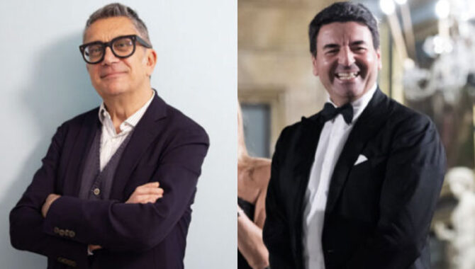
Lucci & Partners’ Paolo Lucci and Montegrappa’s Giuseppe Aquila discuss the design details that informed this interpretation of a Stanley Kubrick classic.
Guiseppe, Paolo, it’s great to catch up. Paolo, let’s start with you – what made Montegrappa a great fit for The Shining?
Paolo Lucci, MD, Lucci & Partners: At Brand Jam, we closely track the most dynamic brand releases. Montegrappa has been on our radar for many years – particularly since it began evolving from a traditional luxury pen manufacturer into a creator of what it calls ’emblems of obsession.’
As the brand works to become more distinctive and relevant to a new audience, its collaborations with licensed properties have expanded in number, scope and creative ambition. From that perspective, a partnership with the Stanley Kubrick Film Archive felt like a very natural fit.
Absolutely. And Guiseppe, what made The Shining an attractive brand to design for?
Guiseppe Aquila, CEO, Montegrappa: The Shining is not just a film – it’s a complete psychological architecture. What makes it so compelling from a design perspective is the way Stanley Kubrick constructs meaning through symbols, space and repetition. The Overlook Hotel becomes a metaphor for the human mind – and every object within it carries narrative weight.
For us, this richness is essential. We are drawn to universes where storytelling is layered and open to interpretation. The Shining offers precisely that: a tension between order and madness, beauty and unease. It allows us to translate cinematic language into physical form – into something that can be held, explored and discovered over time.
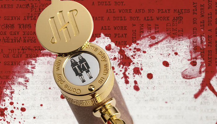
For anyone yet to see this remarkable creation, can you talk me through some of your favourite design details here?
Guiseppe: This is a piece that reveals itself gradually… Almost like the film. One of the most striking elements is the rotating disc beneath the cap’s Ambigram. It references the door peephole, and – as it turns – the twins appear and disappear, almost like an apparition. It’s a small mechanical gesture, but it captures the unsettling rhythm of the film beautifully.
Another key feature is the clip, shaped as the key to Room 237. It’s both an invitation and a warning – an object that grants access, but suggests there is no return. Then there is the barrel: on the fountain pen, it opens like an elevator door, revealing red ink flowing through the Free Drop Reservoir. This is a direct reference to one of the film’s most iconic scenes, but also a way to make the internal mechanism part of the storytelling.
Finally, I’m particularly fond of the continuous engraving of ‘All work and no play makes Jack a dull boy.’ It’s obsessive, hypnotic, and perfectly encapsulates the psychological descent at the heart of the narrative.
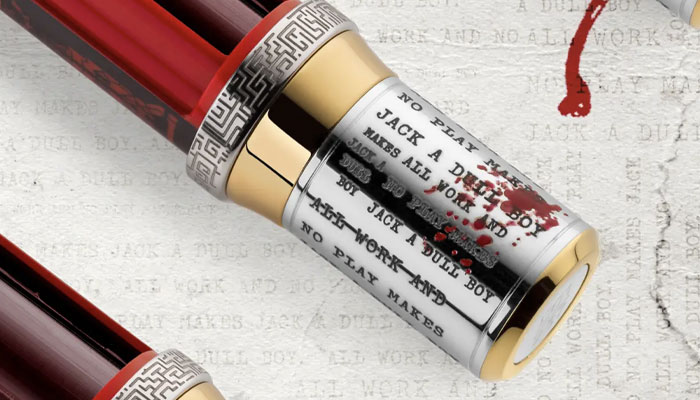
Did any of these design touches prove a ‘tough nut to crack’?
Guiseppe: Yes – particularly the elements that involve movement and illusion. The rotating disc with the twins, for example, required a very precise balance between mechanical reliability and visual subtlety. It had to feel almost ghostly in its effect, not overtly theatrical.
Similarly, translating cinematic moments – like the elevator sequence – into a mechanical function on the pen required several iterations. It’s one thing to reference a scene; it’s another to embed it into the physical behaviour of an object.
These challenges are part of what makes such projects rewarding. When a detail works seamlessly, it disappears into the experience – but achieving that simplicity is often the most complex part.
“Our role is not to replicate – it’s to interpret.”
Absolutely – and what dictates how ‘far’ you go design-wise? What helps you know when to add, and when to streamline?
Guiseppe: It’s always a question of coherence. With a subject like The Shining, the temptation is to include everything, because the film is so dense with references. But our role is not to replicate – it’s to interpret. Every detail must serve a purpose within a unified narrative.
We tend to think of it as editing rather than adding. The design evolves until every element feels necessary, and nothing feels decorative for its own sake. When you reach the point where removing something would weaken the story, you know you’re close.
In this case, the balance was between richness and clarity. The pen had to feel immersive, but never chaotic – much like Kubrick’s own visual language.
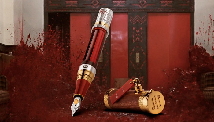
What does a brand need to have in order to be of interest to Montegrappa?
Guiseppe: At its core, it needs cultural resonance. We look for subjects that have shaped collective imagination – icons that people recognise not just visually, but emotionally. Beyond that, there needs to be depth: a narrative universe that can sustain interpretation and reinterpretation.
Equally important is alignment in values. Craftsmanship, authenticity and a certain timelessness are essential. We are not interested in fleeting trends; we are interested in stories that endure.
Finally, there must be room for transformation. The most interesting collaborations are those where we can translate an idea from one medium into another – where cinema, art, or history can be reimagined through the language of fine writing instruments. That is where Montegrappa operates: at the intersection of culture, craftsmanship and storytelling.
And Paolo, what’s key to fruitful collaborations between yourself, the brand you represent, and your licensees?
Paolo: We work across all types of collaborations – brand-to-brand partnerships, retail projects, artistic curations, and, of course, licensed collaborations. In some ways, licensed collaborations are more straightforward, because IP owners are often highly motivated to work with narrative-driven brands that can elevate and extend the relevance of their properties.
That said, not all IP owners approach collaborations in the same way. Those who rely on a more traditional, mainstream licensing model can sometimes focus too heavily on short-term commercial outcomes, overlooking a crucial point: a successful licensed collaboration is a creative partnership. It requires the licensee to interpret the core values of the IP through its own capabilities and craft a product that is both meaningful and narratively rich.
Our role is to help create alignment and effectiveness between both sides of that equation. In the case of the collaboration between Montegrappa and the Stanley Kubrick Film Archive, that alignment came very naturally.
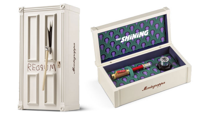
And what other categories do you see as being of interest for Kubrick and The Shining moving forward?
Paolo: During his time at Gucci, Alessandro Michele did a great service with the 2022 Exquisite Collection campaign, replicating the visual language of Stanley Kubrick’s films to stage the collection. That moment made it much easier to demonstrate the narrative power of Kubrick’s work in connection with brands looking to deepen their storytelling and treat their products as expressive platforms – not just objects, and not only within the luxury space.
Brands like Jacques Marie Mage have done an exceptional job in the curated eyewear segment, and these are exactly the kinds of thoughtful, design-led projects we’re interested in pursuing in collaboration with the Stanley Kubrick Film Archive moving forward.
Guys, congrats again to you both – and to the brand’s global agent Caroline Mickler – on this terrific launch.

Royal Armouries’ Senior Licensing and Partnerships Manager Jack Wanstall on the past’s future deals.
Stephanie Milton, Publishing Director for Bonnier Books UK’s Studio Press imprint, on why licensed titles have an advantage at retail…
The team at Juiced talk briefs, client relationships – and working on Sonic.

From Todd Snyder to tonies: Katie Huber – Senior Director of Licensing at Fred Rogers Productions – discusses new partnerships.
“How can we evolve style guides?”: Stacey Bates-McCue, Licensing Director at Fluid, on innovation, fandom – and PAC-MAN!

“The look, the design, the audience, the messaging… It all appealed”: Nico Blauw reveals what made Pembe the Pink Cat a winner for BOTI.

Receive the Brands Untapped Newsletter
Enter your details to receive Brands Untapped updates & news.