—-
To stay in the loop with the latest features, news and interviews from the creative community around licensing, sign up to our weekly newsletter here


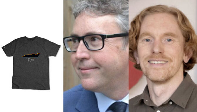
“The wider 70s vibe and general motorsports trend is very hot now”: The Brand Director’s Tim Collins and Sharp Sharp’s Steve McInerny on putting authenticity at the heart of the James Hunt style guide.
Guys, it’s great to catch up! We’re here to discuss the development of this James Hunt style guide. Tim, before we dive into that, can you tell us more about the James Hunt brand and the partnerships you have in place already?
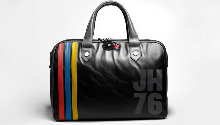
Tim Collins, Director, The Brand Director: James won the 1976 F1 drivers champion after an epic season fighting with Ferrari’s Niki Lauda – this was the depicted in the award-winning Ron Howard movie Rush. James started driving for the private team Hesketh and when they dropped out of F1 he moved to McLaren. He was very much a personality in the sense he was regularly featured on both the front and back pages of the newspapers – his colourful private life and racing performances made him a superstar and put F1 very much into the mainstream.
As we approach the 50th anniversary of that championship, the Hunt family wanted to both celebrate their father’s life and achievements. We’ve already got deals with Topps/Fanatics, digital partners like Natural Motion Gaming, EA Sports and Hutch, as well as Automobilist for high end prints.
What were some of the key objectives for the style guide?
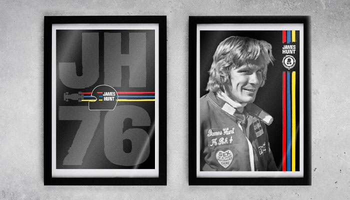
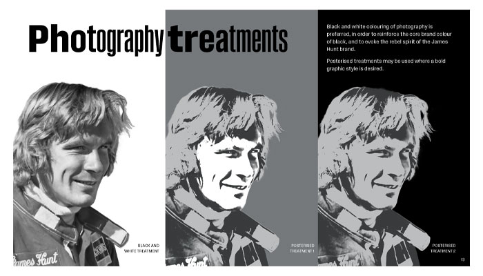
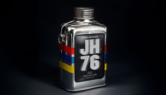
Tim: We need assets for companies to use and wanted to lean into the wider 70s vibe and general motorsports trend, which is very hot now. James used a three colour stripe from his old school colours on his racing helmet, which is used in the guide and is part of our trademark programme.
Steve, how did you start your engine, as it were, when you got this brief?
Steve McInerny, Founder, Sharp Sharp: I always get as close as possible to the story behind the brand and to its audience. For the James Hunt brand, Tim has been an invaluable source of information about James and the brand as he works closely with the James Hunt Estate – and he also put me onto a very good biography about James by Gerald Donaldson. To understand the fans and what they wear, I’ve also been watching Formula 1: Drive to Survive – it’s addictive! I hope to make it to some motor racing events in the near future too.
I noticed you included Hunt’s old school colours. Can you tell us more about designing authentically and how you achieved this in this style guide?
Steve: Tim was able to get access to James’ original racing helmet and took colour references of the racing colours from that which he passed on to me. This was important as motor racing fans can be very detail oriented. It’s always nice to have a client who knows their way around a Pantone swatch book!
And I always look for a set of core elements which are meaningful to the brand – this comes from the research I do. From there, I can start to have fun and combine them in fresh ways in order to appeal to the audience. The licensing world, to me, is where brands come to play.
Did you have particular product categories in mind when designing the style guide?
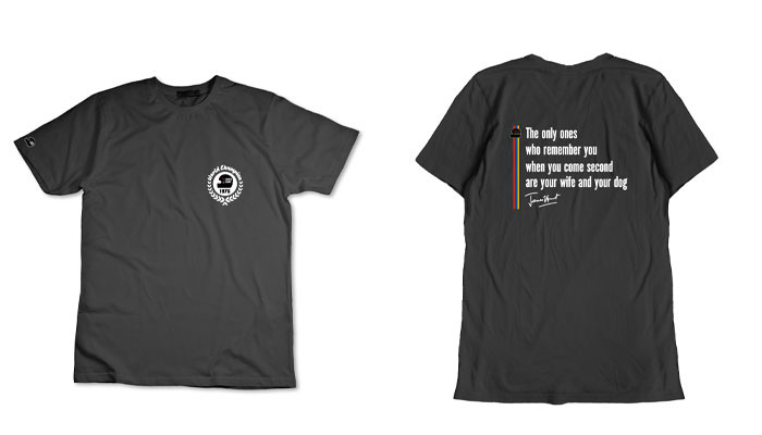
Steve: Tim provided guidance on target categories. I aim to know at least a little about a lot of product categories to ensure that we produce the right types of assets for licensees. For key categories such as apparel, I can enlist the help of a specialist associate. To ensure versatility of the assets we produce, simple is often best. This allows for trend-based graphics to be developed on top of these core elements.
Thinking about specific elements, like the fonts you have used, can you talk us through the development and what makes the guide ‘roadworthy’?
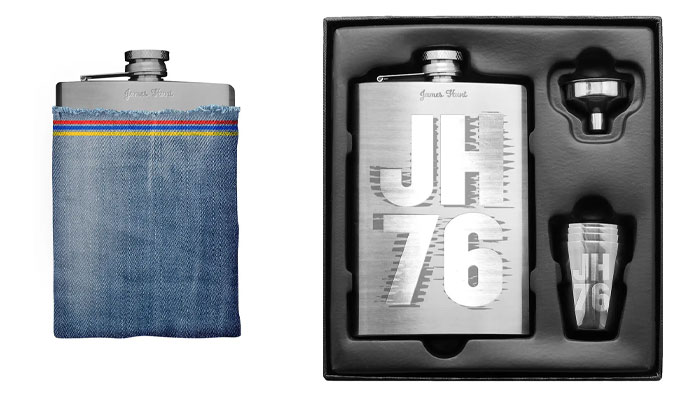
Steve: F1 cars, uniforms, billboards and posters of the era provided plenty of inspiration for the typography. And drivers had their blood group on their overalls in case treatment was needed in an unfamiliar hospital. We recreated this as a detail on some of the apparel concepts.
There are lots of legal, quality and cost considerations around the creation and use of assets in brand licensing, that could be an article in itself! I am very mindful of these, and we’re used to developing assets from scratch in order to address these issues.
The world of motor sports is quite a competitive one licensing-wise. How did you ensure the James Hunt guide stood out and was unique in its styling?
Steve: Tim’s brief to capture ‘the smell of engine oil and the roar of the engines’ in the guide was a great prompt, reflecting the jeopardy of 70s F1 racing. Seatbelts only became mandatory in F1 in 1972! James’ effortless casual style is also unique. I alluded to this in the product and packaging concepts by combining untreated materials, such as distressed denim and recycled card, with more premium ones.
Tim, how would you summarise the appeal of James Hunt and the assets you now have available?
Tim: James is part of a select group of F1 champions that have wide appeal beyond the sports main fanbase – much like Ayrton Senna. With a new audience following F1 now, it’s more about the drivers than the cars and that authenticity is important when we target both older and newer consumers. Steve has tried to blend 70s design into the guide to appeal to both a fashion and motorsports market with logos and other icons.
“There’s lots of mileage in terms of the creative possibilities for the brand.”
More generally how do you see the licensing marketplace shaping up for celebrity-led opportunities like this one? Are there examples from, say, music or entertainment that you would point to as ‘best practice’ in this category?
Tim: Senna in F1 and Steve McQueen are both good examples of automotive and fashion icons which we’re inspired by – James was a good looking man after all!
Can you give us some insight into your licensing plans? What are the ‘priority’ categories you are hoping to secure this year?
Tim: We’ve signed a deal for a documentary and are looking at a book for 2026. Product areas for merchandise include high-end collaborations for watches and clothing . We are working with our licensing agent GTL in securing some of these deals plus looking at more collectibles and mass market clothing.
And to wrap up, Steve, if you had to highlight one or two parts of the Guide you are particularly proud of, what would they be?
Steve: As is often the way with style guides, it feels like there’s still lots of mileage in terms of the creative possibilities for the brand. I’m really pleased with the typography. This includes distressed type treatments intended to evoke the speed and vibration of the cars. I used a typeface with a range of widths, which enables letters and words to be stretched horizontally without resorting to adjusting the horizontal scale – a big design no-no in my book. And I had fun putting together an animated sizzle of the guide for the case study, complete with some bespoke AI-assisted sound effects of the F1 cars!
We dig into brand plans with the Royal Entomological Society’s Anne Weinhold, Head of Development and Projects.
“We’re moving into categories where flavour licensing hasn’t historically played…”: In conversation with Scott Dixon, Managing Director at The Flava People.

Dark art, fashion and mental-health awareness: in conversation with Any Means Necessary’s Shawn Coss.

“There is a massive market being ignored”: Rich Woodall, Head of Awesome at Kawaji, shares anime insights, approval pain-points and plans for this year.

“The independents do an amazing job with licensed toys”: In conversation with licensing stalwart, Lucy Wynn-Jones.

Sasha Reid and Cathy Snow talk Gertrude Jekyll, style guides and creative collaborations.


Enter your details to receive Brands Untapped updates & news.