—-
To stay in the loop with the latest features, news and interviews from the creative community around licensing, sign up to our weekly newsletter here

John Davey Studio’s John Davey talks trends, challenges and AI.
John, it’s good to catch up. To kick us off, what’s the story behind your business?
I started at a studio working on Marvel, Mr Men and Disney – in fact, my first ever brief was design to Superman t-shirts. I learnt a huge amount very quickly and I went on to run another agency before starting my own. So I’ve been in licensing from day one!
What specific skills and insights do you think a design agency needs to have to succeed in licensing?
Number one is a love of the subject. I always wanted a studio full of cool pop culture stuff. I loved cartoons, characters, toys and music – and never craved the rarefied world of spending three weeks discussing the integrity of a typeface. I have a ton of experience designing a mind-boggling variety of projects and still really love what I do.
A cornerstone of design in licensing has traditionally been the style guide. How has this kind of work evolved over recent years?
When I first saw an example of a style guide, they were boring and usually executed by corporate designers. I always wanted the guides designed by us to be an extension of the property, to excite licensing designers to create better product. We laid the guides out differently, reduced the amount of copy, made 3D images of the packaging and – because they were always printed – made them exciting to receive.
“Bill and Ben had an AstroTurf cover, Play-Doh had a yellow foam cover that felt like doh… It was an event to get your hands on one!”
Exciting to receive… Can you give us some examples of how you did that?
Bill and Ben had an AstroTurf cover, Wallace and Gromit had different paper textures throughout to emulate the handmade quality of the films, Play-Doh had a yellow foam cover that felt like doh… It was an event to get your hands on one! It demonstrated a sense of confidence and intent that communicated what the property was about.
Budgets were a lot bigger then too! Now guides are usually delivered as a PDF, but the content still has to be great.
Do your licensing clients have new requirements and needs these days design-wise?
Generally, it’s not hugely different – tons of great assets… The specifics are brand dependant in terms of the balance between patterns, prints, line art and image assets.
These days people do need digital elements for online applications that weren’t around before. Banners and pop ups, for instance.
I work on a range of projects and they can be very diverse, from style guides to production design for animation. In fact, at the moment I’m doing both and owing to the confidential nature of the work I can’t give you specifics. Confidentiality is a big part of this business!
Understood! Let’s dive into what we can talk about – what have been some notable recent projects?
I recently did the David Walliams guide for Harper Collins. It’s ‘The World of David Walliams’ so tying the whole thing together with all of the different book titles was interesting.
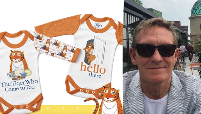
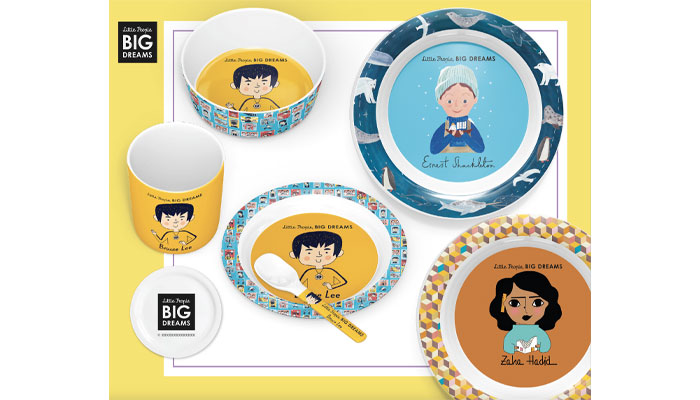
I also did Mog and The Tiger Who Came To Tea. Both were tricky from an image point of view because of the way they were created – old school illustrations on paper! Little People Big Dreams was another recent style guide; very successful books translating to licensing, great illustrations and a lovely creator.
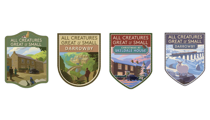
All Creatures Great and Small was intriguing as a book property turned TV – with only photographic assets available – so it was necessary to create a graphic style to accompany the photography. That project really benefitted by having a lovely production team who were keen to help.
As an agency, you have built up a lot of experience of working with publishing properties. What are the specific challenges and opportunities associated with designing for publishing brands?
One of the main challenges – particularly with older publishing brands – is with the diverse range of assets in terms of their quality. I frequently have to deal with illustrations originated on paper in watercolour; that presents challenges for digital delivery… As does the variable quality of the originals.
“Older brands need a subtle update if existing fans aren’t to be alienated.”
Older brands need a subtle update if existing fans aren’t to be alienated. It’s no good designing something that doesn’t fit with the personality of the property. One of the opportunities – as with All Creatures Great and Small – is to create a new look where it doesn’t exist before.
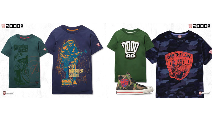
The Dangerous Book For Boys was an amazing book, but the content was basically library images unsuitable for licensing, so that was another instance of developing a total look. I also loved 2000AD; always a favourite and such fantastic imagery.
The original creators in my experience have all been great and only want the best for their brand. I want to please and surprise them – and that seems to have been the case so far.
Thinking about the year ahead, is there one trend you have identified that you think will be significant in the licensing sector?
Not so much a trend as a technical development – AI is bound to change things. Hard to know how at the moment, but anybody in the business of creating images or licensing them must be apprehensive as to how the whole thing develops. The end of civilisation, as predicted by some, wouldn’t be great for licensing either!
Ha! Well, we best not end the interview on that note! So, last question – over your career you have worked on a lot of design projects and style guides. Do you have a favourite?
I have many favourites! Off the top of my head, I did a train carriage for the Disney Store, a nationwide bus advertising campaign, store fronts for Gatwick and Heathrow – put together at 3AM with bored-looking armed policemen as an audience… I also designed and built a five foot snow shaker for Hasbro, visited the sets of Aardman films and created graphics for the film, as well as the style guides – amazing!
I’ve built a three-metre-high pop-up book for Mipcom and more recently designed the space ships and props for The Floogals, toys for Character Group, logos, style guides too numerous to name here, characters… So much stuff! All fantastic jobs with some incredible people – and I’m glad to say it continues.
Thanks again John.

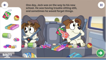
A light touch for the Dark Knight: Simon J. Smith says Batwheels has some of his career-favourite ideas…

“You cannot approach a brand like Kodak or Philips or Electrolux with a generic playbook”: As LMCA turns 40, we catch up with President and CEO Ciarán Coyle.
“The business has only grown because of the people in it – people who care about the work, challenge ideas and take ownership”: In conversation with Jason Knights, MD at Blue Kangaroo.
“Collaborating with incredibly talented artists is such an important part of what we do”: In conversation with Byron Williamson, License & Marketing Manager at Spike Leisurewear.

“In gaming, if you can’t adapt your IP to the visual and mechanical language of the platform you’re entering, you will fail”: In conversation with Elinor Schops, VP of Digital and Gaming at Miraculous Corp.

Kate Schlomann – EVP Business Development and Operations at Spiralcute – on what gives IP like Chiikawa, Mofusand and Koupen Chan licensing potential.
Receive the Brands Untapped Newsletter


Enter your details to receive Brands Untapped updates & news.