—-
To stay in the loop with the latest features, news and interviews from the creative community around licensing, sign up to our weekly newsletter here

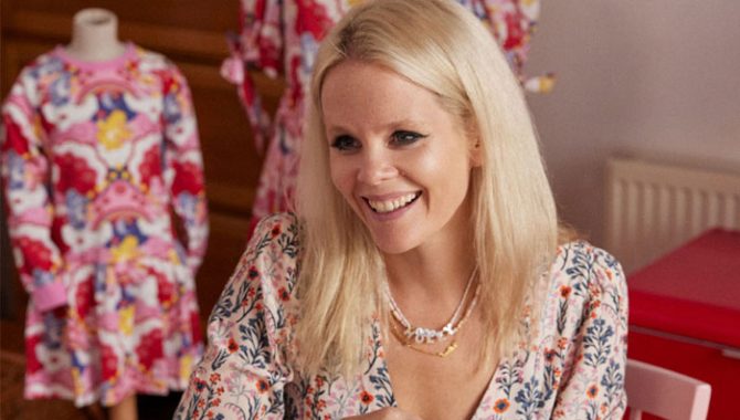
Creative Director Holly Marler discusses what a brand needs in order to mesh well with Cath Kidston’s aesthetic.
Holly, it’s great to connect. To kick things off, what first ignited your passion for design? And what set you off on the path to print design?
My father is an artist and art director and he hugely inspired me. He was always drawing, and so was I! Print design was a natural progression as it combines my absolute love for fashion with illustration and painting. The possibilities in print design are endless, making each piece a work of art. I started my career at Alexander McQueen and Lee taught me that nothing was impossible… He was the world’s greatest. What he taught me gives me lifelong inspiration.
You’re now Creative Director at Cath Kidston. I’d imagine the day-to-day life of a Creative Director greatly differs from company to company, so what does a typical day look like for you? If there is one!
It does always differ from day to day, but I try and keep a constant, which is to continue to hand paint a print for every season. These are my most joyful days as I connect with my print team and get to think quietly about next collections and ideas while I paint.
Most days start by taking my eldest daughter to the ice rink. Even though that’s at 5AM, I find it very peaceful to watch and work at the same time! Often we are shooting the collections – truly delightful days! – so from the rink I’ll run to a location house. We will shoot all categories in a week, and often the set is buzzing with children, babies, dogs, and our amazing shoot team.
All our prints are illustrated to tell stories, so it is important to reflect these stories within the shoot.
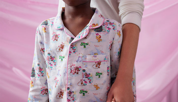
This year has seen Cath Kidston launch licensed collections with brands including The Great British Bake Off, Peter Rabbit, Matilda and now Care Bears. What does a brand need in order to mesh well with Cath Kidston’s aesthetic?
Our brand is emotive and connects with people, our customer is nostalgic, and our prints bring her joy… When we combine that with a vintage character – or emotion that reminds her of her childhood and sparks great memories – it really resonates with her.
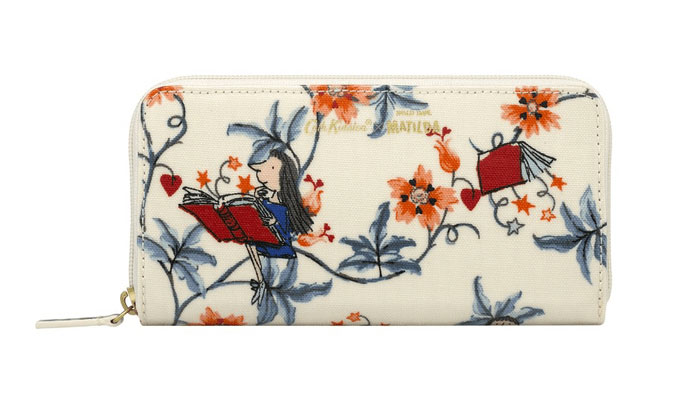
Great British Bake Off spoke to our British heritage as a joyful institution, our customer’s love of baking and the humour and comradery shown in the show. The vintage characters – such a Peter Rabbit and Quentin Blake’s Matilda – are drawn by legends of illustration that we work really hard to complement through our paintings. Our customer loves these original illustrations and knows how special they are.
Yes, I remember seeing the Matilda collection. It looked brilliant.
Thanks! We designed Matilda during the lockdown. The sentiment that Matilda used her love of books and storytelling to take her to another place was really inspiring.
When working on a licensed collection, what’s your creative process for getting to grips with a brand?
We kick off with very in-depth meetings. I really like to research the history of the brand we are collaborating with. I love to find out the original illustrator’s inspirations and passions, so we can really understand what was important for them to portray. With such great artists like this, we have to be hugely respectful.
We really study the drawing style and often purposefully take a different drawing style to shine a light on the original. We also combine the two unexpectedly as this helps create the impact and sense of modernity, while respecting the original artwork.
We should talk about your new Care Bears collaboration. What made Care Bears an attractive brand to design for?
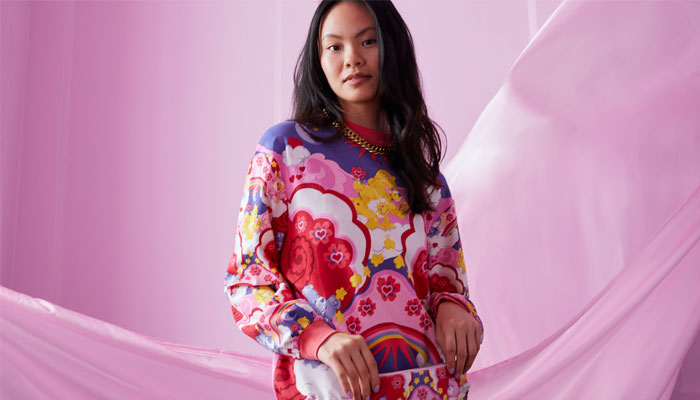
Care Bears is a brand that highlights a caring community and inclusivity; one that cheers others on. This felt like a really important message to illustrate this Christmas, and to do this in such a cheerful way was really heartening. This is all done through colour and character and felt so natural with our florals and paint marks. I was hopeful people would respond to the collection – the unapologetic joy cutting through today’s bleak news stories! – and they really did.
I also love that these new artworks continue to pass on this sentiment as it’s why Care Bears were originally conceived, to be used on greeting cards. Cath Kidston is a gifting brand, so it all worked really well.
“I really like to research the history of the brand we are collaborating with.”
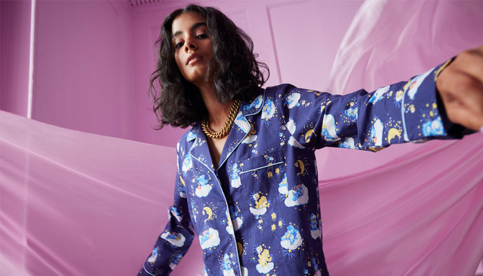
You mentioned about Care Bears origins there, and the brand has 40 years of history to draw upon. What corner of the Care Bears world provided the key source of inspiration for the prints in this range?
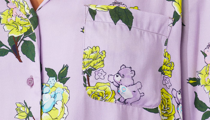
We really responded to the original water colour illustrations by Elena Kucharic; the fluid and loose style captured their sweet character effortlessly. I loved that these cute and kind bears also had a grumpy friend!
We responded to these by creating a print where our florals morphed into the bears with fluid painterly brush strokes, with our similar icons nestled in-between. We also created an impactful psychedelic design with pink and red large graphic clouds and stars, where the Care Bears really shone out thanks to their painterly effect.
You worked with Bulldog Licensing on this project. How was the collaboration?
They were great. They were excited and supportive of the creation of the print. We never use the assets singularly – we always paint the scenery they go in – and Bulldog were really excited to see these print evolve.
What is the key to a successful creative partnership with brand partners?
The huge respect and the shared vision for both of the brands involved is key. We worked very closely with Bulldog on all aspects of the planning, creative and marketing process, bringing our own customer insight, communities and expertise to the table. This in turn expanded the reach and success of the partnership.
“We use a lot of our archive artwork in collaborations so followers of each brand can recognise the heritage icons from each IP.”
Speaking of a shared vision, the Care Bears range manages to feel both very Cath Kidston and also very Care Bears. One brand doesn’t overwhelm the other. How do you navigate getting the balance right?
You’re right; this is a careful balance and one that takes a long time to achieve. We do this when painting scenery to highlight the character, with often contrasting colours to make the elements sing. This kind of colouration is key in our lilac and yellow rose Care Bear pyjamas. We also use a lot of our archive artworks in collaborations so followers of each brand can recognise the heritage icons from each IP – and marvel at how beautifully they sit together!
Holly, a huge thanks for taking time out for this. I have one last question: How do you fuel your creativity?
Spending time with my design teams fuels my creativity. There always seems to be one excited fan amongst us – an expert within our team for each brand we work on! Their passion for these characters and the memories they spark always helps us with ideas for prints.
We always feel so blessed to work on these collaborations and we hope our customers will be excited as us.

Royal Armouries’ Senior Licensing and Partnerships Manager Jack Wanstall on the past’s future deals.
Stephanie Milton, Publishing Director for Bonnier Books UK’s Studio Press imprint, on why licensed titles have an advantage at retail…
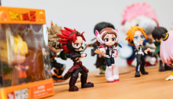
The team at Juiced talk briefs, client relationships – and working on Sonic.

From Todd Snyder to tonies: Katie Huber – Senior Director of Licensing at Fred Rogers Productions – discusses new partnerships.
“How can we evolve style guides?”: Stacey Bates-McCue, Licensing Director at Fluid, on innovation, fandom – and PAC-MAN!
“The look, the design, the audience, the messaging… It all appealed”: Nico Blauw reveals what made Pembe the Pink Cat a winner for BOTI.
Receive the Brands Untapped Newsletter


Enter your details to receive Brands Untapped updates & news.