—-
To stay in the loop with the latest features, news and interviews from the creative community around licensing, sign up to our weekly newsletter here


Stacey Bates-McCue – Creative Director at Fluid Design – discusses creativity, Tetris easter eggs and her love of licensing.
Stacey, it’s great to connect. Before we dive into Fluid’s work with Tetris, how did you come to be working with brands? What led you to Fluid?
I’d actually been on the licensor side for nearly 20 years. I come from Cartoon Network and Viacom, where I looked after SpongeBob, The Amazing World of Gumball and lots of other cool properties. I was Head of Creative at SEGA for many years, looking after that super speedy blue hedgehog.
So I’d been in that space, and I’d actually worked with Fluid on a SEGA project for a retro video game style guide – I thought the way they approached it was really great. I used to work with lots of different creative agencies producing 20 to 30 style guides a year. Lots of them attach the same process to every brand – I found that boring. When I met Fluid, they didn’t really do licensing. I wanted them because they were a real bunch of geeks that could understand that I was after something original for this retro SEGA brand.
I enjoyed collaborating with Fluid on that, then left SEGA when I had my first son. When my son was three weeks old, Fluid reached out to me and asked if I’d like to work for them! That’s when I started up the licensing arm of Fluid. Being in the industry for so long, I had all of these contacts that I could bring to Fluid to start up my part of the business.
“I love trying to push the boundaries of creative.”
That was nearly eight years ago, and my department is now one of the biggest within the company. We work globally with a whole host of entertainment brands, spanning everything from preschool to Resident Evil, across video games, film, TV, music…
How would you sum up your approach to working on creative for brands?
I love trying to push the boundaries of creative. Working in licensing can be quite constraining sometimes with regards to what you can and can’t do with a brand, but I like that challenge. You can be creative in clever ways. I love working in licensing.
Let’s talk Tetris! What made working on the brand a fulfilling creative challenge?
Because they have no character art! It’s just those little Tetriminos!
I was at the Licensing Expo in Vegas a few years ago – I didn’t have a meeting with Tetris, but I spotted their stand. I loved playing Tetris as a kid and still play it now, but I looked around their stand and thought they could be doing more with their merchandise. I spoke to one of their lovely team members and explained how I looked at Tetris as a fan and how I’d love to take it on as a creative conundrum.
I wanted to see where we could push it beyond just those ownable Tetriminos. Yes, people know the Tetriminos, they know the colours and they adore the gameplay, but I felt there were lots of creative opportunities to properly explore the heritage of the brand. It’s 40 years old next year – it’s mega! Everybody knows Tetris.
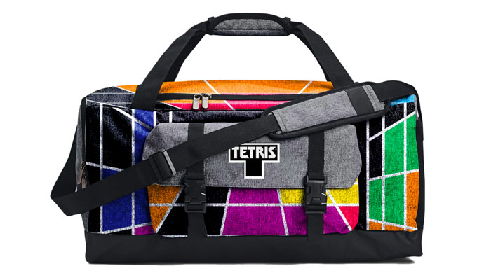
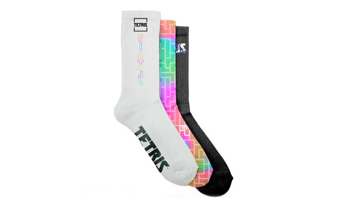
We had a few meetings and started working on our first project together: Tetris Through Time, looking at 40 years of the brand. We’ve done a mini style guide for each decade and combined them into one guide. And the guide isn’t just focused on the Tetriminos – it’s far more expressive. Hopefully, existing licensees and new licensees look at it and get really excited to do some fantastic creative for one of the coolest brands there is.
I want to dive into that a little bit. What was that process like exploring the brand beyond the Tetrimino?
It was really difficult. As part of my proposal to Tetris, I asked to do an audit on everything they had created to date. I wanted to look through all their previous guides to find out what worked, what didn’t work and where the gaps were. It was a really important step.
Tetris has evolved over the years, and the modern Tetris logo is so well known today, but for someone playing the game in 1984, their nostalgia isn’t wed to that logo – I felt it was missing the nostalgia part.
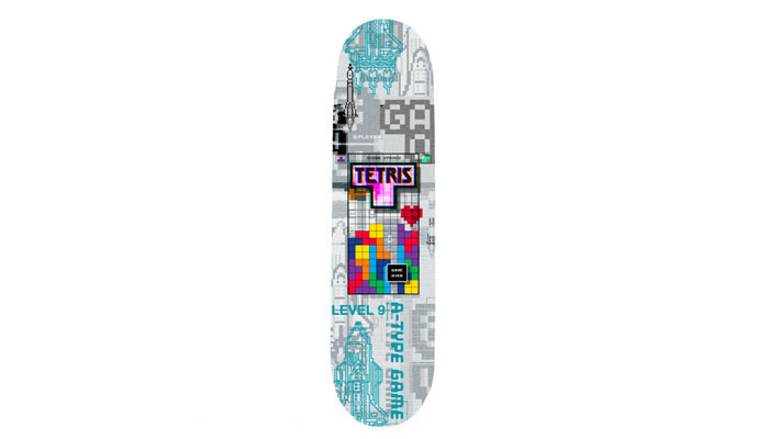
To answer your question, I went back to what the game looked like on the Commodore 64. It was that neon green on black and that was it. You didn’t have the different colours. If we were going to be celebrating each era of Tetris, it needed authenticity and nostalgia. When it came to 2010 onwards, we looked at how we could push the boundaries a bit more… Blending the Tetrimino colours, putting gradients in them, having the dark background come back to allow those colours to pop…
I also wanted to make people feel like they were going into the world of Tetris and we wanted to look at all the elements that people geek out on. They may not necessarily be key gameplay things, but those easter eggs mean something to core Tetris fans and we have plenty of those in the guide.
Can you give us some examples of those easter eggs?
Well, it was helpful for us to pull the camera lens back a bit. You can be so focused on that grid of gameplay, but if you pull back a little bit you then get the levels, the scores, the ‘Next’… That’s all key but people tend to focus on the ‘drop’.
We also looked at including terminology like ‘hard drop’. When the shape arrives that you’ve been waiting for, you press the hard drop and it goes all the way down really quickly. Having ‘Hard Drop’ with an aesthetic where you see that shape dropping fast, rather than a flat graphic – there’s life to that. It feels like you’re watching gameplay.
We also explored perspective. What does the grid and the Tetriminos look like from this angle or that angle? It really casts them in a fresh light. Things don’t need to be over-thought; the Tetriminos just need to be celebrated.
I imagine those sorts of easter eggs are powerful when it comes to unlocking memories and nostalgia for the game.
Absolutely. I learned a lot of this from my time at SEGA with Sonic. For example, if you see an 8-bit pose of Sonic with his arms crossed and his foot tapping, you’ll instantly remember that loading page. To have that image on a t-shirt instead of a generic hero pose is really powerful. It tells a story. That is the joy of working in licensing.
Great stuff. Now, this sounds like a daft question, but with style guides, how important is it that they’re actually usable?
Very, very, very! During my career at Nickelodeon, I was the main publishing designer. I remember saying to my boss ‘All of these style guides are made for apparel…’ They weren’t great for publishing. I then did two publishing style guides that were a labour of love for me and only last year in Vegas, I met a lady that used to work at Viacom. She told me they’re still used and sought after… And it’s because they were usable!
“Things don’t need to be over-thought; the Tetriminos just need to be celebrated.”
They don’t need lots of labels like ‘fast fashion’ or ‘autumn/winter’. If something can be turned into something else, or aged up, or changed colour, that’s an evergreen style guide. You don’t need 600 pages or to spend £100,000. You could have a 20-page guide that’s layered, usable and effective. That’s why I wanted to come back to this side of the industry and produce the sorts of guides that I’d enjoy using.
And they do look fantastic. In fact, with the Tetris guide and a lot of your guides in general, I’d imagine die-hard fans of these brands would enjoy flicking through them as much as licensees would. Do you think there could ever be a case to make style guides available to fans as a kind of coffee table book offering – once they’re no longer being actively used? Or am I talking nonsense?!
You’re not talking nonsense… But I would say no! Here’s why… You got excited when you saw the style guide – if everyone got to see it, it wouldn’t be as exciting. Licensing is there to make money, and to make money it needs to feel authentic and exclusive. If you tick both of those boxes, it’ll do well. If a style guide was available for everyone and anyone to see, it would dilute its impact to the point where it might not feel cool anymore.
That said, I understand why people do like to see these things because I’m a fan too – but if the style guide is effective, fans will see that work out in the world on product anyway.
That makes perfect sense. Looping back to Tetris before we wrap up, what have the team there been like to work with on this guide?
The team at Tetris are super knowledgeable and super passionate. That can be a hard trait to work with, because when a team works closely on something for so long, if someone external comes along and says: “Why don’t you try this?” – that can be tough to hear.
It’s not until you really break it down from a consumer’s standpoint, push back a little and ask: “Why not?” that things can start to take shape. So it was difficult to break down some of those barriers, but they’re an absolutely amazing company to work with, a great family to work with and it’s been a real collaborative effort. I hope this new partnership is one that lasts many, many years.
Last question! What helps you have ideas? What fuels your creativity?
Pressure! I like being overworked; I like pressure. It puts fuel to my fire. And for me to feel confident in my creativity, it’s all about research. If you don’t know what the IP is all about, you don’t know who the consumer is and then you won’t know what the style guide should be. If you don’t start the process right, you’ll be forever trying to flog a dead horse.
Stacey, this has been great. A huge thanks again.

“We have lots of ideas and ambition, because the scope of this new adventure is huge!”: In conversation with SBC’s Sophie Bloomfield and tonies’ Rodolfo Amaya.

Brands Untapped’s Billy Langsworthy heads to Milan to chat with Tela’s Gabi Drew and Nicol Vircillo about fandom – and why brands can benefit from a focus on human connection.

“Jem is an artist – and what comes with that is touring, residency shows and other theatrical pieces”: In conversation with Matt Proulx, SVP of Global Experiences, Partnerships, and Music at Hasbro.
“Brands are increasingly embracing gentle colour palettes, wholesome characters and positive messaging”: In conversation with Mima Creative’s Jemima Chamberlain.

“What are your biggest fears?” Heather Antos – IDW’s Senior Group Editor – asks some surprising questions…

A light touch for the Dark Knight: Simon J. Smith says Batwheels has some of his career-favourite ideas…
Receive the Brands Untapped Newsletter


Enter your details to receive Brands Untapped updates & news.