—-
To stay in the loop with the latest features, news and interviews from the creative community around licensing, sign up to our weekly newsletter here

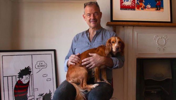
John Reynolds of The Comic Art talks speech bubbles, colour bars and what brands make great screenprints.
Photo credit: Lara Downie.
John, thanks for making time. Can you give us an introduction to The Comic Art and your journey to becoming a screenprinter?
I used to be a journalist and got into ‘what makes a good picture’ by hanging out with photographers. They used to say things like: “Fill the frame with the figure” – that sort of thing! They loved the likes of Henri Cartier-Bresson – the French photographer who helped found Magnum after the war – and through them I learned to think about composition.
From developing film and printing in dark rooms it was a short hop to screenprinting as another way of producing an image. I’d always read comics as a child – as a young man too, actually – and so was an obvious direction to turn to when experimenting with screenprinting.
What were those first screenprints of?
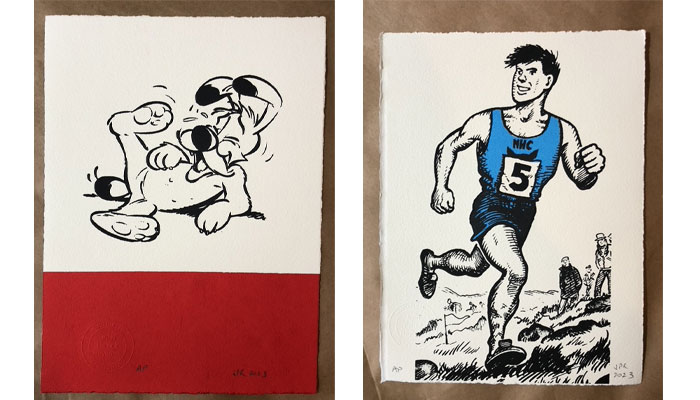
My first screenprints were simple half pages from DC Thomson’s The Victor, featuring the runner Alf Tupper, The Tough Of The Track and the climbing expert Joe Bones The Human Fly. I printed them in red, and large, sort of A2 size… Suddenly, others were interested in what I was printing, so I asked DC Thomson if I could have a licence to sell them. To my astonishment, they agreed!
When I tired of the unpredictability of newspaper journalism – perhaps that should be: when it tired of me – screenprinting offered an alternative income.
“I trawl through annuals or old comics to find images or panels which might work well.”
You now have a wonderful collection of licenses that you develop your screenprints from. How did you choose which brands to work with?
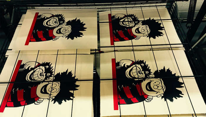
As mentioned, DC Thomson was where it all started… As a boy I loved The Rover and could barely wait for each Saturday for the next issue to arrive. The Rover was the first home to Alf Tupper. DC Thomson granted me my first licence, and of course The Beano and The Dandy are also DC Thomson titles, which covers fabulous characters such as Dennis The Menace, The Bash Street Kids, Minnie The Minx and Desperate Dan. They’re beautifully drawn – and devices such as the red and black stripes are a gift to the screenprinter. The medium is very good at vivid colour and bold outlines.
Next, I was very lucky to gain a licence for DC Thomson’s characters Oor Wullie and The Broons, who are part of Scottish identity. Their adventures are printed every week in the Sunday Post, out of Dundee, so they have a presence in the adult world. I’m not sure there was anyone hand-printing designs featuring these characters before I came along with Comic Art, so there has been a certain appetite for them.
And you’ve also worked with brands outside of DC Thomson?
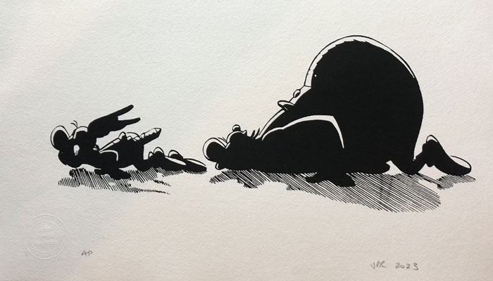
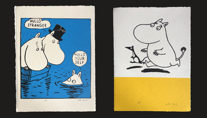
Yes! I turned to Asterix because the Asterix books have quite a sophisticated humour to them and I hoped they would appeal to adults. My prints are not cheap – they’re beyond most children’s pockets – so I need adults to buy them. The Moomins are also a move in that direction… The characters deal with adult themes, so I’m hoping they’ll also appeal to grown-ups.
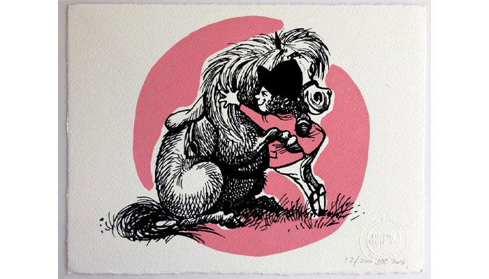
I also have Thelwell. It was a great licence to pick up because ponies are such a part of so many peoples’ lives – there are about three million riders in the UK – and nobody has ever drawn horses so fondly.
Do you have a set process for selecting the images you work with?
I either choose attractive depictions of the characters and place them in simple but striking graphic contexts – a coloured bar at the bottom of the image has become a kind of Comic Art style… Or I find panels which work on their own and make sense out of the context of their story.
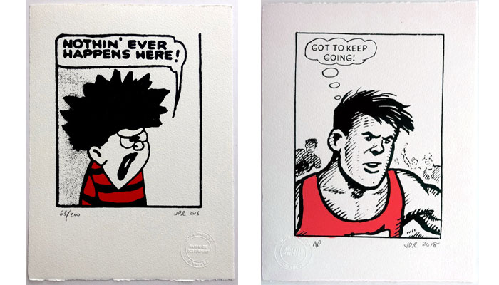
The speech bubble is also key. I’m always searching for a strong, short speech bubble such as the runner Alf Tupper’s gritty “Got to keep going”, Dennis the Menace’s “Nothin’ ever happens here” or The Moomins’ “We’ll sink or swim together.” Sometimes the IP owners’ own style guides will provide good material, but much of the time I’m trawling through annuals or old comics to find images or panels which might work well.
Your use of colour is striking across every collection. How did you alight on the colour palettes you use?
I started out playing safe, using bold primary colours, but started using more shades in an attempt to distinguish my ranges from each other. There are more pastels for my Thelwell prints, for instance. I should perhaps pay more attention to what colours are trending… I was buying some blinds recently and the shopkeeper told me that mustard is in vogue at the moment. Perhaps I should use that – I liked it!
Do you ‘edit’ your designs? How do you judge your own prints throughout the development stage?
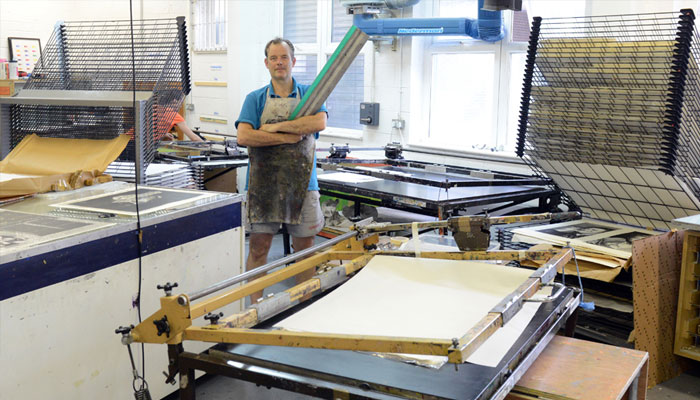
A lot of panels or images just don’t work out as screenprints – they look good in the comic but just don’t translate. To make the screenprint, first I have to break the image down into its colour components and then create separations for each, to print these one at a time.
“In a world where so much is mass produced, there’s charm in the handmade.”
Sometimes the final image just doesn’t work or have the charm of the original. That can often be because of the way I’ve misjudged which parts of the panel to apply the colour, but it’s heart-breaking when it happens because you have such high hopes for each one.
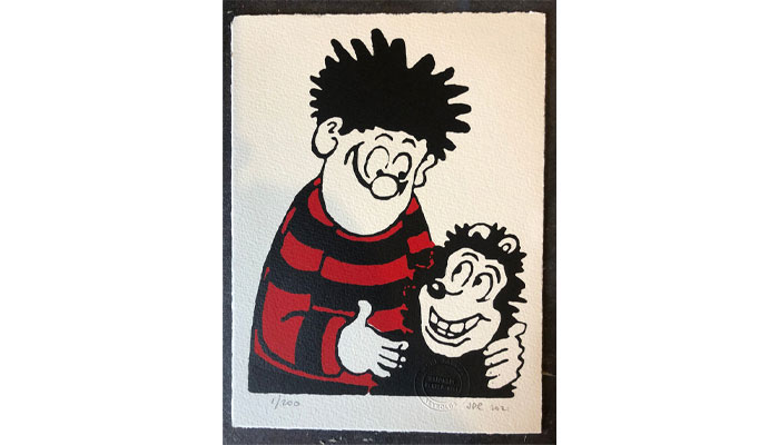
That said, sometimes it works the other way around. I found an image of Dennis and Gnasher hugging each other in an old annual. It was quite a small image, sitting on a red bar, and I had no particular hopes for it – but it turned into one of my bestsellers ever! It’s very satisfying when it works out.
You exhibited at Top Drawer earlier this year. What was your thought process behind this and how was the show for you?
For Comic Art to flourish, both retail – from the website – and wholesale – to the trade – have to work. And the pandemic was a lean time on both fronts, so I took a stand at Top Drawer to build up my trade customer base again.
I’m not sure that such trade fairs are as busy as they used to be, but I’ve not found – myself – that the online alternatives very effective. And they’re inspiring. I like those shows because they feel like capitalism in the raw – people with an idea, a product, something to sell and the energy to get it out there, all gathered together in a cathedral to commerce to sell their wares. But I think I was a bit rusty and my stand design wasn’t as impactful as it might have been.
I appreciate the honesty! You mentioned the trade there. What sort of retailers sell your products?
I have screenprints for a large range of retailers – from grand art galleries such as the V&A Dundee and the National Galleries of Scotland to local art galleries, print shops, framers and gift shops. I like to think that my prints are a rare offering: they are handmade works of art, on beautiful mould or hand-made paper – but at high street prices. And I have the niche pretty much to myself… My customers have said that they can’t find similar prints anywhere else.
From a consumer point of view, what do you think is the motivation for buying one of your prints?
Many of my customers are drawn by fondness for the characters – and then select them for their graphic boldness, humour or the drama they find in them.
In a world where so much is mass produced, there’s charm in the handmade. My prints have the evidence of the screenprinting bed on the reverse – there are often smudges or excess ink there. I kind of love that… Not that I put them there on purpose! They are the product of a real human being – me – instead of having their soul in a computer or machine.
Absolutely! Finally, if you could curate a ‘pop up’ exhibition of two or three other screenprinters’ work, who would you showcase?
I have a great affection for Andy Warhol – it might be a cliche, but I love the way he played with the medium. He enjoyed the inherent and inevitable flaws in the process of transferring ink from a screen to paper. I should learn from that – I’m too careful about trying to keep it neat and discard prints which are a bit faded or slightly mis-registered. I don’t have the confidence to put them on sale – when perhaps customers might like it, as I do, and appreciate it as characteristic of the hand-made medium.
I also love Patrick Caulfield for his colours, sense of humour, his uncluttered vision. And Julian Opie would make a great third choice – I admire his simplicity.
John, a huge thanks again! And folks can check out your work over at www.thecomicartwebsite.com.
“The look, the design, the audience, the messaging… It all appealed”: Nico Blauw reveals what made Pembe the Pink Cat a winner for BOTI.
Start Licensing’s Ian Downes discusses industry twists and turns with three of his former colleagues from Copyright Promotions – Simon Gresswell, Andrew Levy and Daniel Avener.
Jack Fox, Sales & Marketing Director at Rubber Road, talks TUBBZ Mystery Eggs – and why Minions were a perfect fit.

Spin Master Co-Founder Ronnen Harary talks to us about his exciting new book, working with inventors – and Spin’s most underrated launch.

How Speed Arena: Race in a Case became an instant hit: in conversation with Carrera Revell’s Frank Tiessen.
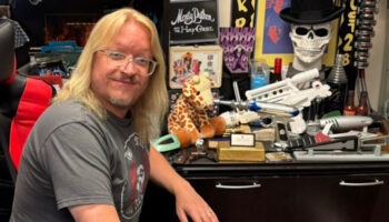
“I guess I never really grew out of it…” Barry Eldridge onwhat makes a license right for Factory Entertainment.
Receive the Brands Untapped Newsletter


Enter your details to receive Brands Untapped updates & news.