—-
To stay in the loop with the latest features, news and interviews from the creative community around licensing, sign up to our weekly newsletter here


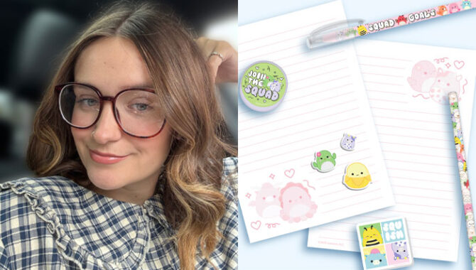
“There is a lot more novelty coming through in stationery and accessories…”: In conversation with Mima Designs Jemima Chamberlain.
Jemima, can you tell us a little bit about your company Mima Designs and its focus?
Mima Creative, like many new small businesses, came about during lockdown. At the time I had been working in a studio which mainly focused on print-ready artwork and didn’t allow for much creativity. Lockdown gave me the chance to explore my own creativity, which is when I started designing and selling prints and on Etsy. While this was always more of a side project, it made me realise that I wanted to focus on a career that could spark my creativity.
My family in particular have been incredibly supportive and encouraged me to take the step and open Mima Creative. I’m lucky to have a home office in the garden where I work surrounded by cats and dogs all day long. My family and my future with my partner are the main source of my focus and motivation, and they inspire me to produce work I’m proud of.
How do you find inspiration for your design work? How do you keep on top of trends?
Pinterest is my go-to for design inspiration! I find sorting my saved images into different aesthetics really helpful – it keeps me from feeling overwhelmed, and helps me form a clear, cohesive direction for a range. I also make a point of keeping up to date with fashion retailers, for example I noticed how successful the bow trend was last year and how it appeared across everything from graphics to appliqués. Seeing that inspired me to think about how similar details could influence product and character design.
When I look at trends, I try to consider which ones will naturally connect with certain licenses and feel authentic to the brand. For instance, I noticed the rise of the cottagecore trend on TikTok and Instagram and felt it paired perfectly with the woodland-themed Squishmallows. From there, I used icons, phrases and characters from their asset library to create a range that stayed true to their core brand values, whilst still tapping into a current trend.
You have worked a lot in the stationery and accessories categories. What trends are you seeing in those sectors?
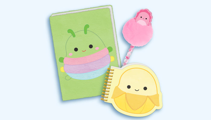
There is a lot more novelty coming through in stationery and accessories at the moment. In accessories, bag charms and keyrings are proving to be especially popular. Consumers are drawn to soft, fluffy textures, and the trend of loading up bags and keyrings with as many chunky charms as possible.
In stationery, pens with novelty elements like 3D character toppers are performing really well too. Both of these trends fall into the collectable market which has been growing for a while now, as people love to mix, match and personalise their everyday items.
You’ve worked with brands like Pusheen, Miffy and Hello Kitty. Is it intimidating or liberating working with such well known brands?
It honestly feels more exciting than intimidating! I usually find it quite liberating as these brands already have such strong personalities and devoted fanbases, which gives you a clear design focus while still leaving space to be creative and expand on the unique attributes of the license. I feel really fortunate to have grown up with many of the licenses that I have worked on – like Hello Kitty and Miffy – so I already have a genuine connection and understanding of what makes them special. Being a fan myself helps as I can think about what I’d love to see as a consumer and design a range from that perspective.
How do you get to grips with a brand on a licensed project?
Before starting a project with a newer license, I like to immerse myself in its lore and vibe by exploring their website, shops and social media to get a feel for its tone and focus. I also look closely at their primary fanbase, what they’re engaging with and interested in, and think about how to combine those interests with fresh, creative product ideas.
And when it comes to style guides, what makes a good one?
I like when a guide includes a short explanation about its overall focus and tone, and what it’s trying to achieve. That being said, the best style guides give structure without being too restrictive, so there is still room for creativity. It’s also important to have a strong core guide that represents the brand’s identity that you can always refer back to, and therefore can be mixed with trend-led elements.
While I believe in quality over quantity, it’s equally important to have a wide array of assets so that the product doesn’t feel repetitive and stagnant. I find it helpful when there’s a wide selection of poses and icons to adapt the compositions and patterns more freely.
You have recently been working on designs for Pembe the Pink Cat. How has that gone and what can you tell us about the range you have designed?
I’ve absolutely loved working on Pembe and exploring their world of self-acceptance and self-expression! I really love the concept of Pembe and Little Pembe – it’s a refreshing twist on what’s come before, so I focused on highlighting that relationship in the range.
Since this is Blueprint’s first Pembe collection, I kept the design quite classic, using a soft colour palette of mint green, lilac and dusky pink, combined with simple colour-blocking, and focused on recognisable poses and icons. I’ve included plush items and incorporated positive affirmations on each product to emphasise the uplifting, warm and self-loving aspects of the brand. Overall I wanted the range to feel true to Pembe’s character and beliefs, and I feel confident that I’ve achieved that.
Do you design with specific consumers in mind?
Yes, I always make sure when I’m briefed to work on a design that I have a clear understanding of who the end consumer is. Most of the ranges I work on are aimed at the teen and kidult market, which is the area that interests me the most and one I relate to personally. I often think to myself: “Would I be interested in buying this?” and “What could make this product stand out?” This also helps me keep the designs authentic and relevant.
Understanding the retailer who is selling the product is just as important as the consumer, as the two are closely linked. Knowing where a product is being sold helps me tailor the design for a specific audience, from aesthetic preferences to product finishes and features. For example, a younger consumer maybe be more drawn novelty or interactive items, while an older consumer may prefer something subtler or more premium-feeling.
Returning to stationery, do you look at the category in other countries? What lessons can we learn from how other countries develop their stationery designs and products?
I tend to look at Asia’s stationery market in particular, as I find the way they build cohesive collections so interesting. One example that really stands out is how you can buy the same novelty pen in multiple designs, which instantly makes it feel collectable, which of course is hugely popular at the moment. Everything is so thoughtfully designed – and often small, cute and full of characer, creating that ‘I need them all’ mindset, even if you don’t. Japan leads the way when it comes to creativity and collectability in stationery, and it would be a dream to visit Tokyo one day, experience that culture first-hand and see how it influences design trends up close.
Looking at the wider licensing market, can you pick out two or three product ranges that you feel are noteworthy?
Everything Harry Lambert touches seems to turn to gold, and his collaboration with Zara and Disney was no exception. It instantly filled me with all the nostalgia, and I love anything that takes me back to my childhood! I love how the range feels extremely 90s while still aligning with current fashion trends. Incorporating the character’s attributes into the clothing, like polka dots, faux fur and chunky heeled shoes shows incredible attention to detail and feels authentic to the brand and the campaign.
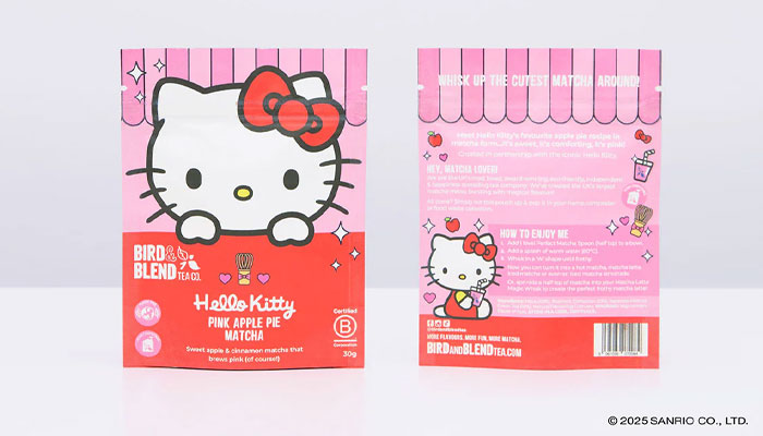
I was walking around Cambridge recently when I stumbled upon Bird & Blend’s Hello Kitty display in the window and couldn’t resist going in for a snoop. The collection was so cute, and I was so impressed with how much they were able to include of the character and her traits. They’d made the shop feel like you were in a Hello Kitty café, especially as they’d introduced a pink apple pie matcha and tea. The combination of both brands’ identities was clear yet complementary – I particularly liked the exclusive matcha whisk and pink apple drink icons.
Finally, I know you are a fan of sitcoms. If you could design one range based on a sitcom, what would it be?
I’m not sure if it counts as a sitcom but Gilmore Girls would be such an exciting project to work on! I would draw on the 2000s nostalgia of the show, from Lorelai’s iconic t shirts to the events and aesthetics of Stars Hollow – of course using an autumnal colour palette to tie it all together. Arguably the most important aspect of the show –other than coffee! – is the relationship between Lorelai and Rory, so I would focus on that with matching mother-daughter items. The range could include fashion, accessories and homeware pieces that feel like they could naturally exist in the Gilmore home, combining style with a sense of story and character.
Great pick! Thanks again Jemima.
We dig into brand plans with Nikki Beckett, MD at The Snowball Effect and the Royal Entomological Society’s Anne Weinhold, Head of Development and Projects, and Francisca Sconce, Senior Outreach and Learning Officer.
“We’re moving into categories where flavour licensing hasn’t historically played…”: In conversation with Scott Dixon, Managing Director at The Flava People.

Dark art, fashion and mental-health awareness: in conversation with Any Means Necessary’s Shawn Coss.

“There is a massive market being ignored”: Rich Woodall, Head of Awesome at Kawaji, shares anime insights, approval pain-points and plans for this year.

“The independents do an amazing job with licensed toys”: In conversation with licensing stalwart, Lucy Wynn-Jones.
Sasha Reid and Cathy Snow talk Gertrude Jekyll, style guides and creative collaborations.


Enter your details to receive Brands Untapped updates & news.