—-
To stay in the loop with the latest features, news and interviews from the creative community around licensing, sign up to our weekly newsletter here

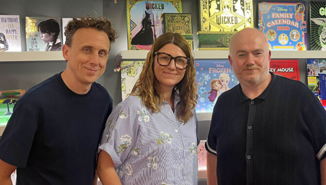
In conversation with Danilo Productions’ Head of Design for Cards Corrina Cartlidge, Head of Design for Calendars Bradley Green and Licensing Director Dan Grant.
Guys, it’s great to catch up. Let’s dive into the design process behind Danilo’s licensed cards and calendars. What kicks things off?
Corrina Cartlidge, Head of Design, Cards, Danilo Promotions: For cards, if it’s a new licence, we’ll have conversations about where we could go with it, as well as factoring in what the sales teams, licensors and retailers need from a range. There’s lots of different stakeholders. We might have a really tight brief, like ‘an Xbox Son birthday card’, or the other extreme of ‘we need new Christmas concepts across all brands?’ So there’s always key factors: Who’s it for? What’s the occasion? It needs to resonate emotionally and make sense – to both the receiver, but also to the person buying it. And 80% of card buyers are women, so that comes into it too.
And then we authentically integrate the brand into that. Some are more generic, some are very tailored – how far you can push things generally depends on the brand. But emotion and sentiment is always key – and that’s different for every brand we work on.
Is there much crossover in the process when it comes to calendars?
Bradley Green, Head of Design, Calendars & Diaries, Danilo Promotions: There is crossover, but because we’re more seasonal we have kick-off meetings with licensors at specific times of the year. That’s important because with a lot of brands, we’re doing multiple calendars and diaries – I think we have 10 with Liverpool FC this year! So we’ll meet and lock down the products and the content needed – is it just going to be image-led? Will there be editorial? We might be using a style guide, or if a style guide is limited, we’ll look at creating assets ourselves.
Then the design team will talk about ideas, themes and who the right designer is for a particular project. For example, I handle the Star Wars jobs because I’m a huge fan and know the brand inside out.
So being a fan of what you’re working on is important?
Bradley: We all do our research, and style guides are comprehensive, but I think it can be important. When we first started working on Pokémon, we didn’t have a fan of the brand in-house, so I took the time to do a deep dive into the brand to understand it properly, because it’s important. Fans will know if something doesn’t make sense. And if there are gaps in our knowledge, we’ll always lean on our licensor – especially if we’re working on a calendar for a new film. They’ll know what we should focus our efforts on creatively.
“Innovations like stickers, badges, colouring in and pop-ups have gone down well.”
Dan Grant, Licensing Director, Danilo Promotions: One of Danilo’s biggest strengths is our relationships with licensors. For them to allow us and trust us to go away and do what we do, but also to allow us to give feedback to them. It’s always a genuine two-way relationship.
What makes a great licensed calendar?
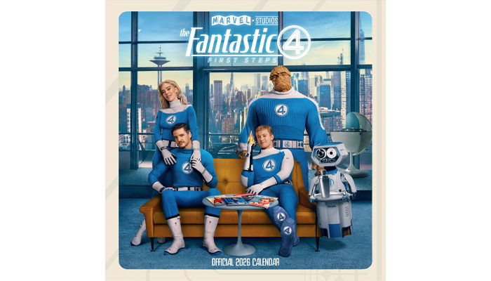
Bradley: It needs to have multiple elements – it can’t just be an image, that’s boring! They need some editorial, like a nice quote from a character. I’ll always push for the best creative possible. A good recent example is our Fantastic Four calendar. Disney is wary of spoilers, so their early style guide was grounded in graphics, more than stills from the movie. We took the decision to hold back development of the calendar until after the film was released, so we can utilise shots of the actors from the film. It led to a far superior calendar than what we otherwise would’ve had if we’d gone early.
Dan: The thing to remember is someone uses our calendars six months after we’ve developed them. By the time they’ve got it on their wall, some of that content could be out of date already. Therefore we always want to have the latest imagery for that reason. We wait on music brands quite a lot to ensure we have up-to-date tour pictures, like with our Iron Maiden calendar this year.
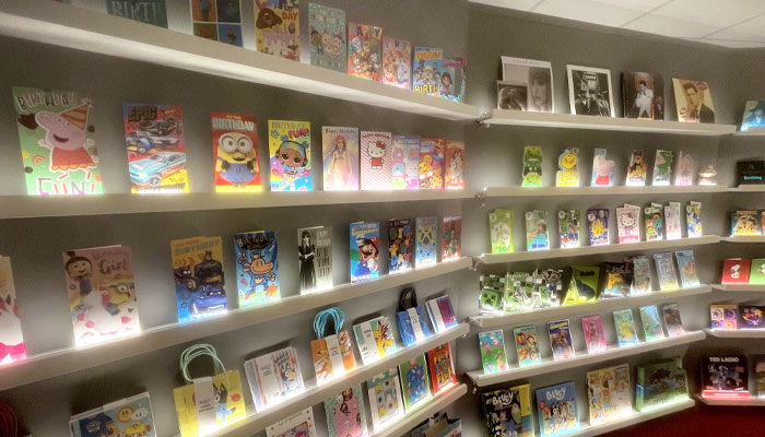
Corrina, what makes a great licensed card?
Corrina: With juvenile cards, you want a great character prominently on there and it needs to be easy to see what the sending occasion is. Bright colours, attractive top third to catch the eye in store and the brand message must be conveyed clearly and authentically.
We also add innovation like stickers, badges, colouring in and pop-ups that have gone down well – and some of the pop-ups can be quite complex! We did a Grinch Showcase range for Tesco last year that featured badges, fur, moving cards and detachable elements that doubled as Christmas decorations. We created around 100 concepts that were slimmed down to the final 16 – each with different applications and innovations.
“One of Danilo’s biggest strengths is our relationships with licensors.”
Wow! Did that process feed other launches? I’d imagine you have new strings to your bow after coming up with so many iterations.
Corrina: Absolutely – and we’re actually doing similar collections for other customers this year, utilising even more innovation-led lines on one of the biggest ever-green Christmas brands. The biggest of these ranges will land this year.
Bradley, can calendars feature similar levels of innovation?
Bradley: Absolutely. A good example is our deluxe calendars. With those, we can use more unusual art from exciting trend guides and each page can also be removed to become a poster. We’ve got some nice finishes in there.
Corrina: It’s great to be able to utilise these cool trend guides that we might otherwise not use for the more mass-market launches.
Dan: Calendars tend to have two uses: functional or as wall art. With the deluxe calendars, you’re really getting 12 posters and that will attract a different consumer to the standard calendars.
What makes an effective style guide for you guys?
Bradley: With calendars, it’s about having enough usable content. You might have a beautiful style guide with 10 bits of character art. That’s great, but it’s not enough for a calendar, so we need more guides to include at least 12, factoring in the needs of a category like ours. The best ones have lots of options.
Corrina: It’s the same with cards. We need lots of character art, lots of icons and lots of flexibility. If we get all of that, we’re happy.
Do you feel some style guides aren’t built with your sector in mind?
Dan: Even when I’m being sold licences, I’ll get presented brands and creative-wise, all we have to play with is a bunch of logos. It’s tough to make a calendar out of that.
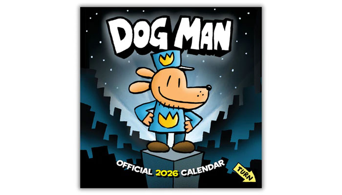
Bradley: That said, we do get some style guides that are amazing. The recent Dog Man style guide is the most incredible one I’ve seen. It’s brilliant.
Dan: And that’s a brand that comes from publishing, so I think there’s an understanding there that has proved a great fit for what we do.
Dan, before we wrap up, does the team’s approach to design feed into the deals you do?
Dan: Absolutely. Whenever I’m looking at a brand, I’ll always try and encourage these guys to take a look and see what’s possible. We want to ensure the brand fits the product rather than the other way around.
And what does a brand need to have in order to suit cards and calendars?
Dan: It helps if they already have a licensing programme in place – the brand owner should be ready for the process and able to support us to develop products. Brand awareness is also important, but everything ultimately comes down to sentiment and emotional attachment. Whether it’s a football club, or The Grinch, or The Traitors – the emotional pull is key.
“A great licensed calendar needs to have multiple elements – it can’t just be an image, that’s boring!”
One other thing is for the brand to be somewhat trend-proof. It potentially takes a year for us to get a greetings card from the development stage and onto a shelf. In that time, a trend could easily have gone, or a fleetingly popular brand could’ve faded. It’s a big risk for our categories.
Looking ahead, what are some recent exciting launches – or ones to keep an eye out for?
Dan: Stranger Things is flying and Wicked is going to be big. Moving into next year, Peaky Blinders will be a highlight with the new movie coming out – and we have ranges across both greeting cards and calendars. There’s also a long-awaited Star Wars movie coming out next year, so the calendar side of things will be driven by movies. We also have another Oasis calendar launching next year, which should capitalise on the ongoing hype around the band.
There’s always lots of buzz with the football clubs, and we’re seeing that in the women’s game as well now. We’re seeing a lot more business through women’s football at club level, and the Lionesses calendar was big for us with the Euros win. There’s lots to be excited about.
From the rise of AI to a Hello Kitty and Friends Inflatables style guide… Jemima Chamberlain talks us through 2025 highlights, challenges and surprises.

From Baby Evie style guides to Warner Bros takeover bids… Dot Dash Design’s Paula Rich and Christa Mavroudis reflect on 2025.

From KPop Demon Hunters to the rise of the Norman… Independent creative Danny Heffer on the highs and lows of 2025.

From new packaging guides to Feathers McGraw tattoos… Aardman’s Ilona Sunderland – Creative Services and Product Development Manager – and Ben Townsend – Product Development Executive – reflect on 2025 highlights.
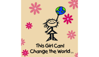
“Our character Jane is the line-drawn personification of where girls are at before they fall off that confidence cliff”: In conversation with This Girl Can! Change the World’s Jacqui Fishman.

Phillippa Green, The Royal Mint’s Licensing and Partnerships Manager, on the newly minted Monopoly coin.


Enter your details to receive Brands Untapped updates & news.