—-
To stay in the loop with the latest features, news and interviews from the creative community around licensing, sign up to our weekly newsletter here


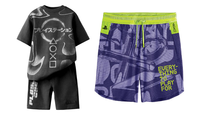
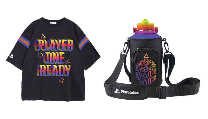
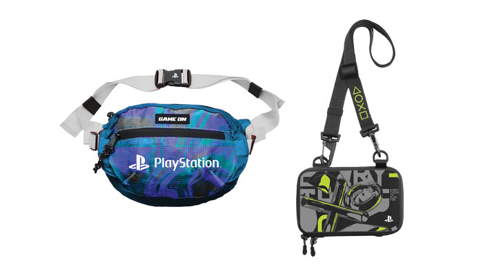
“It’s video games, so play and movement is key”: Stacey Bates-McCue – Creative Director of Licensing at Fluid – takes us inside development of DTR kits for PlayStation.
Fluid has a rich history with the video game industry – how did your relationship with the PlayStation brand begin?
We’ve had a great relationship with Samantha Matthew-Bond – Product Development Manager at PlayStation – for years. We’re very aligned with our thoughts on effective creative and Sam had been desperate to create amazing retail packs and style guides for PlayStation. Video game brands can be cautious when it comes to licensing, but an opportunity came up for PlayStation to try something new when it came to creative. So we were tasked with doing small DTR kits that were specific to certain retailers.
You kicked things off with two guides, one focused on PlayStation kidswear. Talk me through how you tackled it.
It was about exploring the different layers of the retailer it was for, their customer base and the heritage of PlayStation as a brand. It’s a gaming brand, so it needed to have this edgier digital aesthetic to it – but we didn’t want to just focus on the PlayStation logo. For this one, we based it in 90s trends as a nod to 1994 when PlayStation first launched. That came through in this grunge overlay. And then in terms of the elements we have to work with, there’s the triangle, square, circle and cross buttons…
When you put it like that, it’s sounds like quite a limited set of assets to play with…
You’d think, but we found we could really elevate things by adding multiple outlines – it gave the icons a hand-drawn feel, and brought some movement into the assets. Again, it’s video games, so play and movement is key. If we can bring that into a flat graphic, we’re winning. We also added colours that went beyond their traditional colour palette.
And it went down well?
We were told it was presented to the retailer and got a round of applause! They were so excited to see something from PlayStation that they could run with. PlayStation then came back to us for more guides and I think we’re 14 packs into the partnership now.
Brilliant. And it’s a nice example of doing exciting things with a brand that – on paper – is associated heavily with just four iconic shapes.
PlayStation is the holy grail. It sits at the very top of the food chain for me. And it’s a joy to create for a brand that can travel in lots of different directions. For example, we’ve since worked on a PlayStation guide for a different clothing group, so we went into a totally different direction, embracing a 3D holographic futuristic style.
And I suppose it’s all still just scratching the surface in terms of the wider PlayStation brand, with potential around controllers and consoles…
That’s the next route I want to go down! like I’m constantly badgering Sam to do something retro because the idea of doing a PS1 lo-fi filter in a style guide – that retro colour spectrum of the original PlayStation logo… I think people would really gravitate to it. It’d be cool to explore that.
Last question! Has working on these PlayStation guides given Fluid any new ‘tools’ in the toolkit? Or energized the team in a certain way?
It’s given us a sense that you can really take anything anywhere, as long as you spend some time with it. It’s also given us a new sense of clarity.
In what sense?
When we now work on more character-based IP, we’re confident in not having to go ‘too heavy’ on the characters… These guides showcase how impactful you can be if you really strip things back. Whether it’s through a smart use of a colour palette, or a unique design execution focused on just a few assets… It’s been a nice lesson and an exciting success story for us.
Terrific. Always a pleasure Stace! Let’s do it again soon.

Phillippa Green, The Royal Mint’s Licensing and Partnerships Manager, on the newly minted Monopoly coin.

In conversation with Bioworld’s Senior Director of Marketing and Intellectual Property, Jason Mayes.

“Consumer demand for trusted brands in food is at an all-time high”: In conversation with Oliver Gilding, Sales and Licensing Director at Food Brands Now.
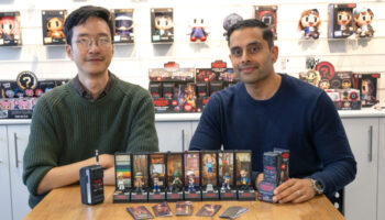
YuMe’s Global Creative Director Gurdeep Bains and Senior Art Director Oliver Chang talk poses, puzzles and pushing the boat out for this latest set of Stranger Things capsules.

“There is a lot more novelty coming through in stationery and accessories…”: In conversation with Mima Designs Jemima Chamberlain.
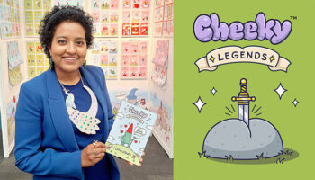
“I had a sudden, humorous vision of a blue, naked wizard soaring through the air!”: In conversation with Arrthi Little, Founder of Arrthi Ltd and creator of the Cheeky Legends.


Enter your details to receive Brands Untapped updates & news.