—-
To stay in the loop with the latest features, news and interviews from the creative community around licensing, sign up to our weekly newsletter here

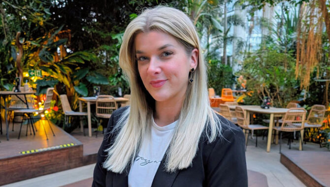
“A good brief is clear but not overly prescriptive.” In conversation with graphic designer Antonia Fox.
Antonia, it’s great to connect. Let’s start at the beginning – you graduated in Graphic Design from University of Huddersfield. Did you always want to work in design?
Yes, I always knew I wanted to work in design. Even at school, I gravitated toward creative subjects. I chose Art and Graphic Design early on, followed by Graphic Design and Photography at A-Level. I was very fortunate to find my first design role quickly after finishing university. I’d written my dissertation on ‘The Importance of Packaging in Cosmetics’, and before I’d even graduated, I landed my first job as an Assistant Packaging Designer for a cosmetics company. It felt almost too good to be true!
What advice would you give to young designers looking to get a foothold in the commercial world?
For young designers starting out, my advice would be to find ways to stand out. The industry is highly competitive, so think beyond a traditional CV. If you’re applying to a greetings card company for example, why not send your application in the form of a pop-up card? Something different that’s tailored to the role can make a huge difference as you’ve put thought into it rather than sending out the same generic CV to all employers.
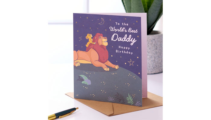
You spent a lot of time working in the greetings card industry at UK Greetings. Can you tell us more about your work there, particularly around new product development?
At UK Greetings, I primarily worked on the Disney license, which was incredibly fun and creative. One of the best parts of the process when developing new ranges was our ‘Immersion Days’. These were dedicated sessions of time where the design team had full freedom to explore new concepts and create without restrictions. These were all about idea generation, play, and pushing creative boundaries. The strongest ideas would then be refined, developed, and sometimes taken forward into full product ranges.
What are the pros and cons of designing licensed cards, particularly in relation to approvals?
The big advantage of working at UK Greetings was the relationship they had with the licensing companies, which made the approvals process smoother than it might be elsewhere. They were very trusting of our ideas and usually came back quite quickly with an answer for if we could go ahead or not. That said, designing for such a major brand does come with strict guidelines. Disney in particular is very protective of its characters, so there are lots of do’s and don’ts to follow!
One of the more challenging areas was humour – Disney understandably has a very specific tone, so we had to be careful not to push boundaries too far, especially on comedy-led cards.
Based on your experience, what are the key elements that make a greetings card work – both in terms of design and messaging?
Storytelling is a huge part of what makes a card work. You want the narrative to flow visually and emotionally, from the front of the card through to the words on the inside and out. Character placement and layout is key. Also working with the editorial teams to use wording cleverly to tie in with what a character might be doing or what might be relevant to them.
We always worked with official style guides, which included rules. for instance, in most instances characters couldn’t be flipped. This could be tricky when there was only one available pose facing the “wrong” direction, but it challenged us to get creative within those constraints.
“Storytelling is a huge part of what makes a card work.”
I noticed you’ve worked on pop-up and paper-engineered cards. Can you share how you approach designing for this category?
Pop-up and paper-engineered cards have evolved massively in recent years. Previously, the pop-up element was hidden inside the card, but now there’s more focus on delivering that “wow” moment on the front for when the customer comes across it in the rack. Buyers want instant impact, instead of relying on a sticker that says “I pop up!”
This meant experimenting with die-cuts, mechanisms and taking inspiration from pop-up books. Our goal was always to innovate – to make the pop-up bigger, better, and more surprising while still being manufacturable!
You’ve worked with major retailers. From a designer’s perspective, how do you stay tuned into retail trends and work effectively with retail buyers?
A lot of the retailers have in-house trend teams who provide visual direction through mood boards, which is a great starting point. However, I think it’s vital to get out into the real world, visit stores, observe displays and keep an eye on what’s trending in fashion, stationery and lifestyle.
Also using platforms like WGSN to track upcoming colour palettes, typography trends, and movements. Then it’s about translating those insights into designs that that feel fresh and commercially relevant.
More recently, you’ve created your own pet product brand – Rocky’s Pet Products. Can you tell us more about it and how you approached the brand identity?
Yes, Rocky’s Pet Products was inspired by my French Bulldog, Rocky. I always loved it when friends gave me gifts with Rocky in mind as it felt so thoughtful and personal. That sparked the idea of creating a gift that could be given to someone with their pet at the heart of it. That’s how our ‘Make Your Own Dog Lead Craft Kits’ were born.
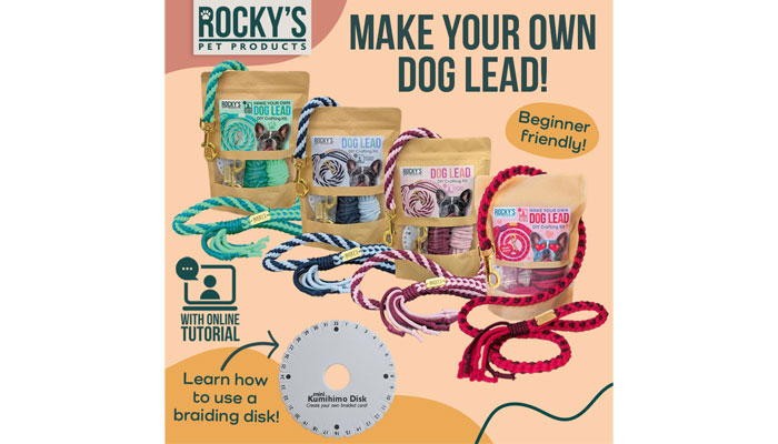
When it came to branding, I wanted it to feel fun and crafty, but not overly feminine or childlike. It was important that it had an elevated, design-led feel that felt giftable and special. Rocky’s Pet Products actually started out with quite a different business model, so I’ve recently revisited the brand identity and pulled together a much more cohesive brand guide. It captures all those key elements of crafting, creativity, and care with a clear, consistent look and feel that reflects where the brand is now heading!
You also work with other businesses using design to help them grow. What sort of projects have you been working on, and how do you measure success?
Yes, and it all really stemmed from Rocky’s Pet Products. As I transitioned into running my own business, I spotted a gap… So many brilliant small brands had great products or services, but lacked a clear story. Something that makes people care, connect, and ultimately buy.
Since then, I’ve worked on a variety of projects, from start-ups finding their feet to more established businesses looking to refresh outdated logos and re-engage their audience with a more modern, meaningful brand identity. I’ve also recently begun working closely with a gifting publisher, artworking book covers and designing contents pages and spreads.
For me, success is a happy client. It’s about bringing someone’s vision to life through the power of visual storytelling.
“For me, success is a happy client.”
You must have written and received a lot of design briefs. What do you think makes a good brief?
I think a good brief is clear but not overly prescriptive. It should outline the goal, the target audience, and any essential information – while still leaving room for creative interpretation. There’s nothing more frustrating than hearing, “I’ll know it when I see it.”
With my clients, I usually send out a short questionnaire to get to know them and their business better… Where they are now, where they want to go, what they like, and just as importantly, what they don’t like. It gives us a solid starting point and helps align expectations from the beginning.
The best projects always come from collaboration. Being honest, clear, constructive and kind. It goes a long way in creating the best possible outcome for everyone involved!
Finally, is there a specific artist or designer who has influenced your career?
Honestly, not really! I’ve never been the type to spend hours in galleries or follow a particular art movement closely. That said, I did love Andy Warhol and Salvador Dalí back in high school. I think I was drawn to their boldness and the surrealist way of seeing the world.
More recently, I’ve found inspiration through artists on Instagram. I follow a mix of small illustrators and more established artists, and one in particular is Sophie Tea. I really admire how she’s built her career by sharing her journey so openly on social media. She’s a big advocate for body positivity, and I love how she combines her art with a strong personal message.
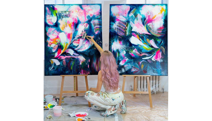
It’s a reminder of how powerful the blend of creativity and storytelling can be… Something I obviously try to bring into my own work too!
From the rise of AI to a Hello Kitty and Friends Inflatables style guide… Jemima Chamberlain talks us through 2025 highlights, challenges and surprises.

From Baby Evie style guides to Warner Bros takeover bids… Dot Dash Design’s Paula Rich and Christa Mavroudis reflect on 2025.

From KPop Demon Hunters to the rise of the Norman… Independent creative Danny Heffer on the highs and lows of 2025.

From new packaging guides to Feathers McGraw tattoos… Aardman’s Ilona Sunderland – Creative Services and Product Development Manager – and Ben Townsend – Product Development Executive – reflect on 2025 highlights.
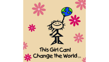
“Our character Jane is the line-drawn personification of where girls are at before they fall off that confidence cliff”: In conversation with This Girl Can! Change the World’s Jacqui Fishman.

Phillippa Green, The Royal Mint’s Licensing and Partnerships Manager, on the newly minted Monopoly coin.


Enter your details to receive Brands Untapped updates & news.