—-
To stay in the loop with the latest features, news and interviews from the creative community around licensing, sign up to our weekly newsletter here


Louise Hinds, Head of Creative at Aykroyds, talks us through the company’s recent evolutions.
Louise, it’s great to connect. Aykroyds has expanded its reach in recent years. What’s been your role in transforming aspects of the company?
Before joining, I knew Aykroyds as a nightwear business. They brought me in to bring the company into the 21st century because, with all due respect, some of the handwriting was looking tired. It needed a shake-up and that’s what the team wanted me to do. And it wasn’t about shaking-up just the design handwriting of Aykroyds – it was the processes too.
When I started, we had 18 designers across Kids and Adult. I’m still hiring, but we’ve now got 34 including talent from H&M, and colleagues that’ve worked on style guides. More recently, we’ve onboarded some fantastic graduates to bring us innovative ideas – they’ve settled in so well. What’s more, the industry is recognising that our work has evolved.
What do you think is key to crafting successful licensed apparel?
It’s all about storytelling. It’s capturing that brand, its essence and really understanding it. We’ve made some of our team ‘licence champions’ – they’re tasked with knowing the do’s, don’ts and brand values of IP we work with across the portfolio. It’s key that we know these brands inside out.
Also, while we’re mainly EMEA focused, anything we now do for Primark is global, so we have to think internationally. With Primark, we’re also looking to be disruptive – create something you wouldn’t expect… Something clever. And that goes for design and the choice of brands we go after.
You’re working with various style guides for different brands… What makes an effective style guide for you?
We need flexibility within the brand guidelines… We really need to be able to add our own assets and icons. We like to do that because there may be a specific trend coming through that we’d like to bring into the design. And if there isn’t a guide, my team will create our own – that can also help make things completely exclusive to a retailer. We do that a lot in our adult team – especially on ladies’ nightwear. I encourage the team to really push things. So it’s about flexibility… When a style guide’s not flexible, it can be hard.
Do you think your work gets enough credit in licensing? Especially when so much attention is paid to things like ‘high-end’ collabs.
If I’m honest, no! We’ve just done a load of fantastic ranges for Primark, like our brilliant Sesame Street range – and these lines are massive. We’re about to drop another exclusive range and the biggest one we’ve done – about 800,000 units. And it’s all from our own handwriting. So yes, I’d say Aykroyds does have a defined handwriting, but we’re not Stella McCartney, so it’s looked at differently. But if you look at what we’re doing, it’s really cool and more elevated than ever.
Absolutely – and we’ll do our best to correct that in our own way! Now, to which ranges would you point as being good showcases for the design approach at Aykroyds?
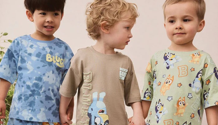
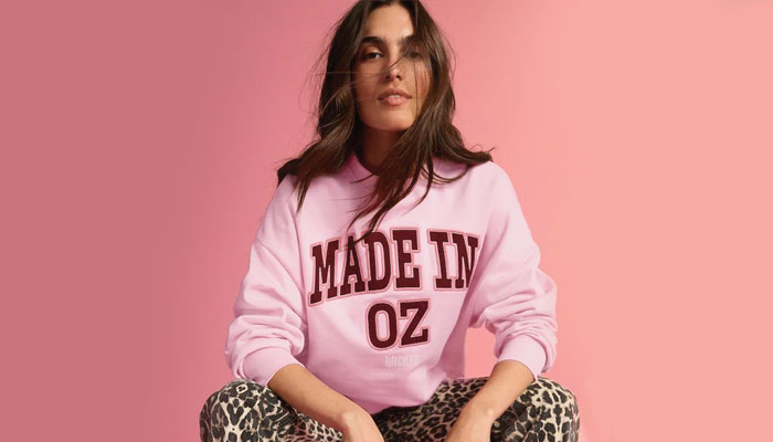
The Sesame Street range that we dropped for Primark; that was massive and it sold out quickly. We did a terrific Scooby-Doo line for Primark too. We’re having a really interesting time with M&S at the moment and the handwriting there is beautiful. Our relationship with Next is going from strength to strength. We’ve just done a range for River Island that’s bonkers – in a good way, of course!
The shift in our design handwriting has opened up so many opportunities. The Wicked range we did for George and Tesco is another one I’d highlight. We did an initiative with George and the Prince’s Trust that was amazing too… It’s been an exciting time!
Have you seen retailers wanting more ‘design-led’ ranges when it comes to licensed product?
Absolutely. Everyone’s handwriting is changing. M&S’s mantra is ‘dumping the frump’ and they’re looking more and more like the UK high street equivalent to Zara. Tesco wants to be like The White Company, Sainsbury’s wants to be ‘the M&S of the grocers’. There’s a real design shift happening at that grocer level. Erica Davies is doing loads of drops with George and I love her. That’s elevating the grocers. The standards are way up.
What dictates how subtle, or loud, you go with a design?
It’s usually the brand – and comes back to storytelling or trends. With our work on Wicked for Next, we lent into that varsity-preppy vibe. That came from both the movie – with Shiz University – and the varsity design trend… Whereas what we’ve done at Primark with Sesame Street and Scooby was about taking these iconic characters and having fun with them. That felt true to the brands and to the design handwriting of Primark.
What does a brand need to have these days to suit quality commercial apparel?
I think it comes down to flexibility. A good example is our relationship with StudioCanal on Paddington. There are some strict do’s and don’ts – we must use the TV art for kids’ nightwear, for example… But a lot of retailers prefer the more classic ‘sketchy’ Paddington look. We’ve developed the style to redraw the TV art in a sketchy style. That solves a creative problem for us. If we’ve got a problem, or spot an opportunity, we’ll think of a solution and work closely and respectfully with the relevant teams to work on a positive outcome.

“We are incredibly proud to announce the launch of Nighty Owl – our first charity collaboration rooted in purpose, comfort and compassion,” said Lucy Freeth, Creative Director & Founder at The House of Fandango.

This year’s list includes chats about Skibidi Toilet, Monopoly Go! and Five Nights at Freddy’s.
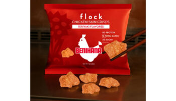
“We are proud to translate Benihana’s legendary experience into a dynamic range of products that consumers can enjoy every day,” said Ari Freedman, Vice President of Licensing at Surge Brands.
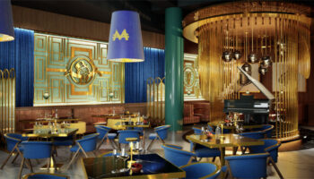
“Monopoly Steakhouse is not just a restaurant; it’s an experience where luxury and nostalgia meet,” said Adrián J. Romero, CEO of Timeless Brands.
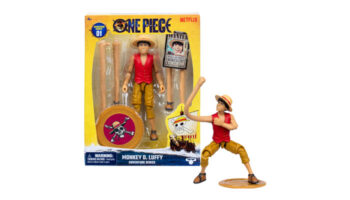
“Every toy in this line represents a love letter to the fans,” said Joe Smith, Vice President of Global Marketing for Licensed Brands at Moose Toys.

After a 10-year tenure with the business, industry veteran executive Philippe Roucoule will be leaving at the end of this year.


Enter your details to receive Brands Untapped updates & news.