—-
To stay in the loop with the latest features, news and interviews from the creative community around licensing, sign up to our weekly newsletter here

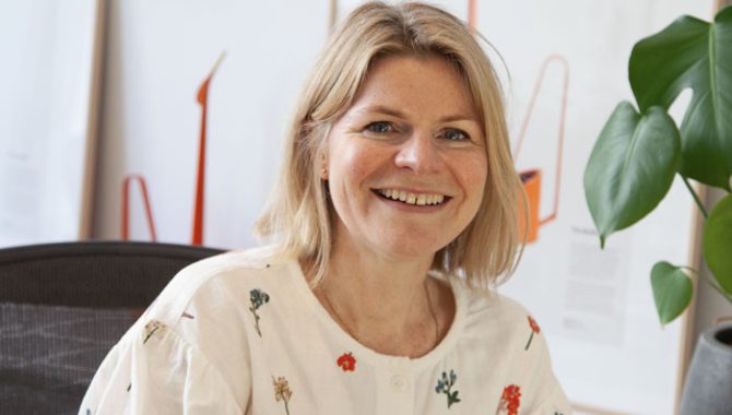
From The Gruffalo to Edith Holden, Heidi – from Heidi Lightfoot & Co – discusses her work on publishing brands.
Heidi, thanks for making time. Firstly, can you give us a potted history of your career to date and your company.
I’ve been working in design and branding for 30 years. For 20 years I co-founded and led the multi award-winning agency Together Design, known for their collaboration and craft. I have a love of design strategy and creative direction and have worked on numerous projects in the arts and cultural sector.
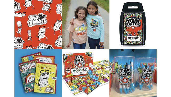
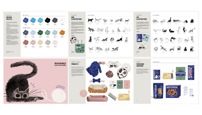
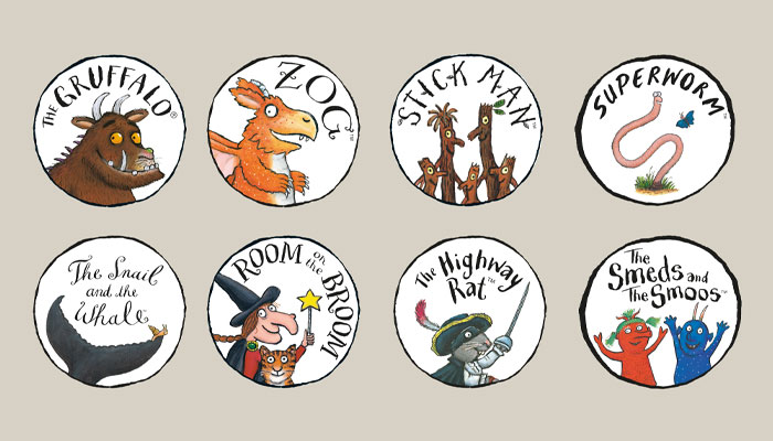
Licensed brands that I’ve worked with includes The Gruffalo, The Snowman and the Snowdog, Roald Dahl, Agatha Christie, Battersea, Tom Gates and many more. I also mentor creative teams and agency founders, so call myself a ‘creative adviser’ as that seems to cover all the above!
Since starting my new company, Heidi Lightfoot & Co, I’ve been focusing on publishing, authors, and book brands as that’s an area I love. I’m enjoying the freedom of being a smaller outfit – it’s only me full-time, partnering with a whole host of talented collaborators as required.
“Following fleeting fashions will erode consistency and cohesion – two touchstones for long-lasting brands.”
As a designer, can you give us your thoughts on what makes a good brief from a client?
I will always have a lot of questions. It’s friendly interrogation! First there’s the planning part – I’ll want to know about key deadlines, and who needs to see what, when. I like to agree how the work we deliver might be judged a success – to ensure the project is organised, effective and energising for everyone.
Before any design begins, we need to fully understand the history and story of the brand, ambitions for the future, current and target audience groups, competitors, values and attributes. I also like to audit any current design assets. If I get to visit an archive then I will be VERY happy!
Sometimes we’re given all this information, but more often I go digging for it and facilitate a workshop to explore the brand positioning and discuss ideas for the project. This work, at the beginning, is vital for building a shared vision and gives great focus to the design stages.
Sounds like a very smart approach. You’ve worked on a lot of style guides in your career. Do you think the role and content of a style guide has changed over the years? What makes a good style guide today?
Designing the visual identity is only the first step. Defining it clearly and making it easy to use is the main challenge. I’ve always tried to create beautiful yet practical style guides that bring everything together into one essential resource for everyone – from internal teams to external partners.
To start, the design solution needs to be a system that’s easy to follow, with a clear role for every element. I used to see guidelines that were essentially asset libraries. Lots of design elements but not much logic or guidance on how to bring it all together. There’s less of those now thank goodness!
Having created brand bibles, guidelines, toolkits and style guides in many forms, we believe that the best ones are a series of balancing acts; rules versus inspiration, personality versus mechanics, show versus tell… A great guide combines the perfect articulation of the brand, alongside the technical delivery of multiple assets and a wealth of guidance.
Terrific insights. Thank you. Now, what do you do to keep up to date with trends and new design developments?
I’m look at the latest developments in graphics, art, homeware and fashion, however I also enjoy looking back at historical art movements and the cultural events that inspired them.
For me, it’s less about trends that might be here today and gone tomorrow. I get that there are bigger retail trends that a brand may be asked to work with, but they’ve got to fit with the brand personality. Following fleeting fashions will erode consistency and cohesion – two touchstones for long-lasting brands.
Likewise, I try not to get fixated on competitor differentiation for the brands I work on. Pulling something away from adjacent brands – or worse, moving it closer. The important word for me is ‘relevancy’. What could our brand do, that no one else could? Which parts of the story or characters lead to exciting and ownable opportunities for development? How can it behave, look and sound unique, and utterly itself? The time spent getting to the heart of a brand will always lead to distinctive results.
“The time spent getting to the heart of a brand will always lead to distinctive results.”
You have worked a lot with publishing brands. Are there specific challenges you face when creating design resources for these kinds of IP?
Yes, there are. There are often very few proprietary assets for authors and book brands. The IP of recognisable design elements may sit with a book cover designer, or the publisher’s marketing department. Promotions for books may also vary wildly in different markets and we need to understand their global appeal. There are also different needs as a writer’s career develops and their readership grows. Lastly, no single person will be responsible for the careful filing of book artwork, so we often receive fairly patchy source material. Does that all sound like one big moan?
Not at all!
Good! It shouldn’t because it also creates a lovely open brief! For fiction authors we will often be starting from scratch to create the brand assets that are uniquely theirs, and that’s exciting.
When I’m working on a publishers’ company brand, for example Penguin Random House, I’m hyper aware of their heritage and standing in the industry. The work we do must honour the past and move them forward. No pressure!
And I imagine different types of books throw up different opportunities and challenges.
Yes. With picture books we have more to work with, but it’s finite. For example, The Gruffalo is only 26 pages long. From that, we have created hundreds of assets which have been used on thousands of products in the 15 years since we developed the first style guide. It’s all about the interpretation and providing just enough flexibility to cover many needs. Importantly, we never stray too far from the story’s essence and visual world; you don’t mess with something that good.
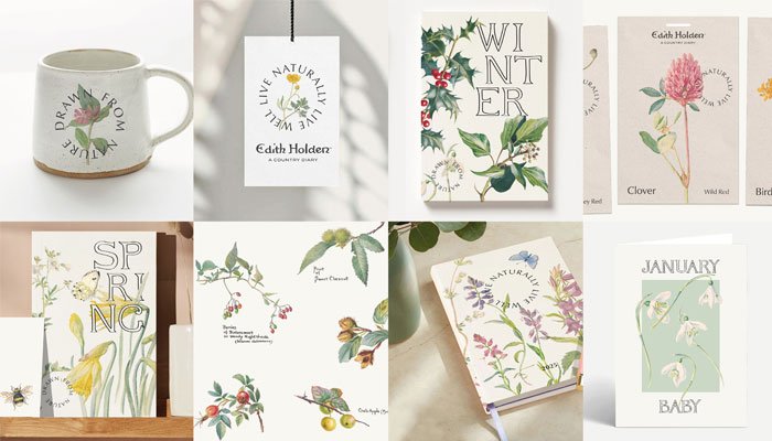
From The Gruffalo to The Country Diary of an Edwardian Lady! Recently you developed a new style guide for that classic property. Can you talk us through that project?
The book was a runaway best-seller, and the licensing programme hugely successful. So, we knew it had broad appeal. But success had led to many different interpretations of design, which had diluted the brand. The name and logo varied from place to place, and it no longer had a signature look. We examined everything it had going for it, that would appeal to a modern consumer, and we also took a hard look at what was holding it back. The lovely client team were brave enough to question everything.
Over time the story of Edith, the artist and conservationist, had been overshadowed by her beautiful artwork. As part of the repositioning, we changed the branding to ensure her name, Edith Holden, was front and centre as the brand name. We dropped ‘Edwardian Lady’ which made it sound rather prim and proper and didn’t suit the illustrations, which Edith painted outside, down at ground level, in all kinds of weather conditions!
So now the brand is known as Edith Holden: A Country Diary.
Exactly. We also brought Edith’s handwriting back into the designs. We use her photo on packaging and we tell her story on every product. She was an incredible woman who cared about the natural world. She deserves to be championed and her passions chime with a current understanding, and care, for our fragile environment.
We then turned our attention to the design. We made more of the seasons, creating a family of floral assets for Spring, Summer, Autumn and Winter, allowing licensees to create tailored designs. We also sharpened up the artwork, providing new cut outs and vector files for flexible use. Importantly, we have kept the designs close to the book, combining words and illustrations for a unique and recognisable design style. The end result reflects the property’s past and brings it bang up to date. And working on the project expanded my knowledge of plant names, which I’m grateful for!
It looks great. What advice would you give to product designers at licensees when using style guides. How can they get the most from a style guide?
Every product visual in the guide has a job to do in demonstrating the design system. Scaling, colour use, typography, the combining of assets… It’s all there. We’d say: ‘Read it thoroughly and then enjoy creating your own designs’. We love seeing how different partners and designers interpret the guide for their own products. If we’ve done our job right, then we’ll have given them the confidence and know-how to adapt the artwork for their needs and formats.
And how much thought do you give to the retail market and how retailers might use a style guide? It must be a challenge to develop a guide that works for all commercial partners.
It’s hard to anticipate every eventual need, but we can run through a checklist of potential requirements. We think about materials and formats to make sure we have assets for different channels and a variety of use. We think about seasonality to make sure we have assets for the big moments in the retail calendar. We also think about opportunities for personalisation and promotion – like POS and digital marketing. Lastly, we think about how a retailer might craft a collection that is unique for their customers, to create a sub-brand of the main collection – like what assets should stay fixed, and which can flex.
More generally, what trends have you noticed in licensing recently? And what influence are these having on your approach to design?
I’m interested in the format of the style guide. A pdf and a folder of assets has been the norm for ages, but digital guidelines – Canva, Figma etc – are becoming far more common for big consumer brands. Also, the rise of the co-brand; two licensed brands combined – sometimes in surprising ways – to borrow and share equity. This can be a shortcut to widening awareness. It makes us think about the core assets, those a brand should retain, no matter what, when it appears together with another strong property.
Are there design lessons licensing can learn from other industries?
Consumers today hold their favourite brands to account. They demand quality, care for the environment, a unique offer and, most importantly, they want to know what you stand for – your purpose and values, your reason for being… It’s no different for licensed brands. You need to wear your heart on your sleeve and act on your beliefs.
Heidi, this has been great. My last question is: If you could develop a style guide for any property, past or present, that you haven’t worked on, what would it be and why?
That’s such a hard question Ian. I’m a typical magpie designer. Designing for the things I collect, like Hornsea pottery, Ladybird books… Or favourite authors, illustrators, and artists. People like Lois Ehlert, David Hockney, Eduardo Paolozzi, Jamie Smart, Celia Birtwell, Paul Rand, Zandra Rhodes… The list is long and eclectic! That would be pretty exciting.
A great list! Thanks again.
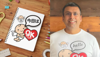
Manoj Dayalji, Brand Manager at Give and Keep, on his brand’s story so far.
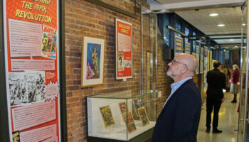
Rebellion’s Ben Smith and Soldiers of Oxfordshire Museum’s Ursula Corcoran talk us through the how and why of their recent Into Battle exhibition.

Formitalia Chairman David Overi on designing items that represent the Bruce Wayne style in a subtle way.
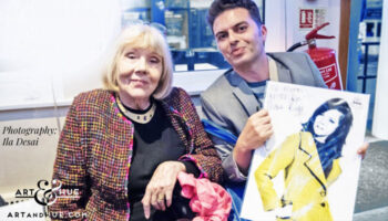
With the 10th anniversary of Art & Hue approaching, Odysseas Constantine tells us how he approached creating pop art pieces for an eclectic raft of brands.

From Kingsman and Churchill to The Ashmolean and more: Alastair Adams on Conway Stewart pens.
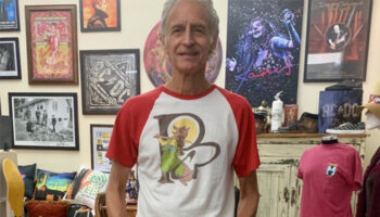
From James Brown to Whitney Houston… Norman Perry – President of Perryscope Productions – talks creativity, design and the importance of ‘the first DJ’.


Enter your details to receive Brands Untapped updates & news.